

Clui Design System
Clui is an online Learning Management System (LMS) used to create, distribute and manage learning content. As a product which had passed through the hands of various designers and front-end developers, Clui had a fragmented design and messy front-end codebase, and needed a scalable design system to improve these issues. This case study walks through building a scalable, responsive design system for an established product, Clui – why and how it was created, and the various decisions made along the way.
The need for a design system
Typically, if I were creating a lean SaaS product, it would be based on an existing UI framework, with much of the legwork done, and then customising it to suit the particular needs of the product. As a SaaS product which had passed through the hands of various designers – and initially designed by a graphic designer from the marketing team – Clui had a fragmented design and messy front-end codebase, and needed a scalable, well-organised design system to improve these issues.
Prior to the design system, there was no real plan for designing for the future – it was a case of designing new features as they were needed, simply copying as much as possible from existing components. Over time, this led to inconsistencies, duplicate components, and a very mismatched look and feel in Clui – for example, there were many more button styles than what was actually needed, dropdowns looking and behaving differently depending on where you were, and colours being used for different purposes.
The need for a design system was evident, not just to clean up the mistakes of the past, but to provide a scalable framework, and a plan for the future. Having a predesigned library of buttons, inputs, text styles, etc. reduces the risk of elements being repeatedly redesigned. It’s all well and good having an established product roadmap and strategy, but if you don’t have a design system in place to back it up, you’ll inevitably run into issues and won’t be working as fast or as smart as you could be.
There was also a lack of understanding of the mobile strategy for Clui, and how each design component would respond across various breakpoints. It was important to consider this throughout the design process, as many parts of Clui were used on mobile, and there had been little consideration for how components would adapt and respond to this.
How the design system was created
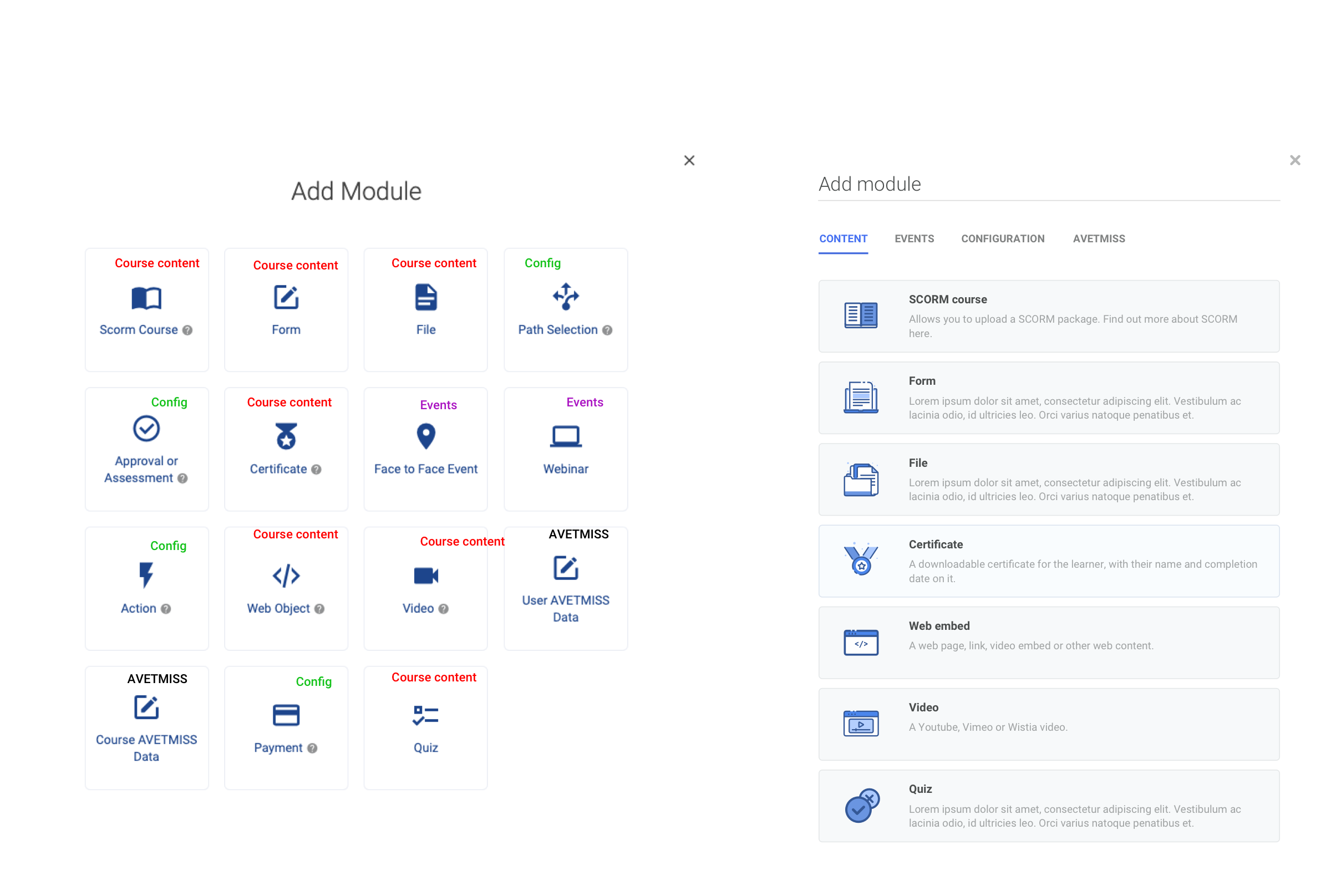
I want to start by pointing out that this was not so much a product redesign, it was more of an inventory, stocktake, clean up and introduction of guidelines and processes, for a poorly managed user interface. Clui had too many established and familiar UI components to start from scratch, and there was no need – much of the product was well designed, it was just a matter of tidying and documenting the design decisions, consolidating the components, and also making sure the design system was scalable and not just considered for a single use case.
After doing some research into other design systems, reading articles online, and looking at pre-built design systems for reference, I started to look at the scope of the project, what availability I would have to be able to complete the design system in a suitable timeframe, and also the best approach for building a design system from an established product.
I began to screenshot all the different parts of the UI, as different user types, in order to see every single component, text style, colour and design pattern. Though tedious, this is was a great learning experience, particularly for someone with fresh eyes on Clui, because it helped me familiarise myself with the product, and see some screens which I didn’t even know existed, including some legacy items rarely being used. After studying this, I turned all of this into an excel spreadsheet, which would become the starting point for the design system, and allow for notes and keeping track of work. Clui had gone through a redesign, which unfortunately was implemented but unfinished, so having screenshots of everything made it very easy to see which parts still needed redesigning. A moodpboard was created with the parts that were to be kept, to see an overview of how the design system would look. I also looked at other design systems, such as Google’s Material Design, to see types of components which didn’t exist in Clui, but should have, in order to accomodate for them.
Colours
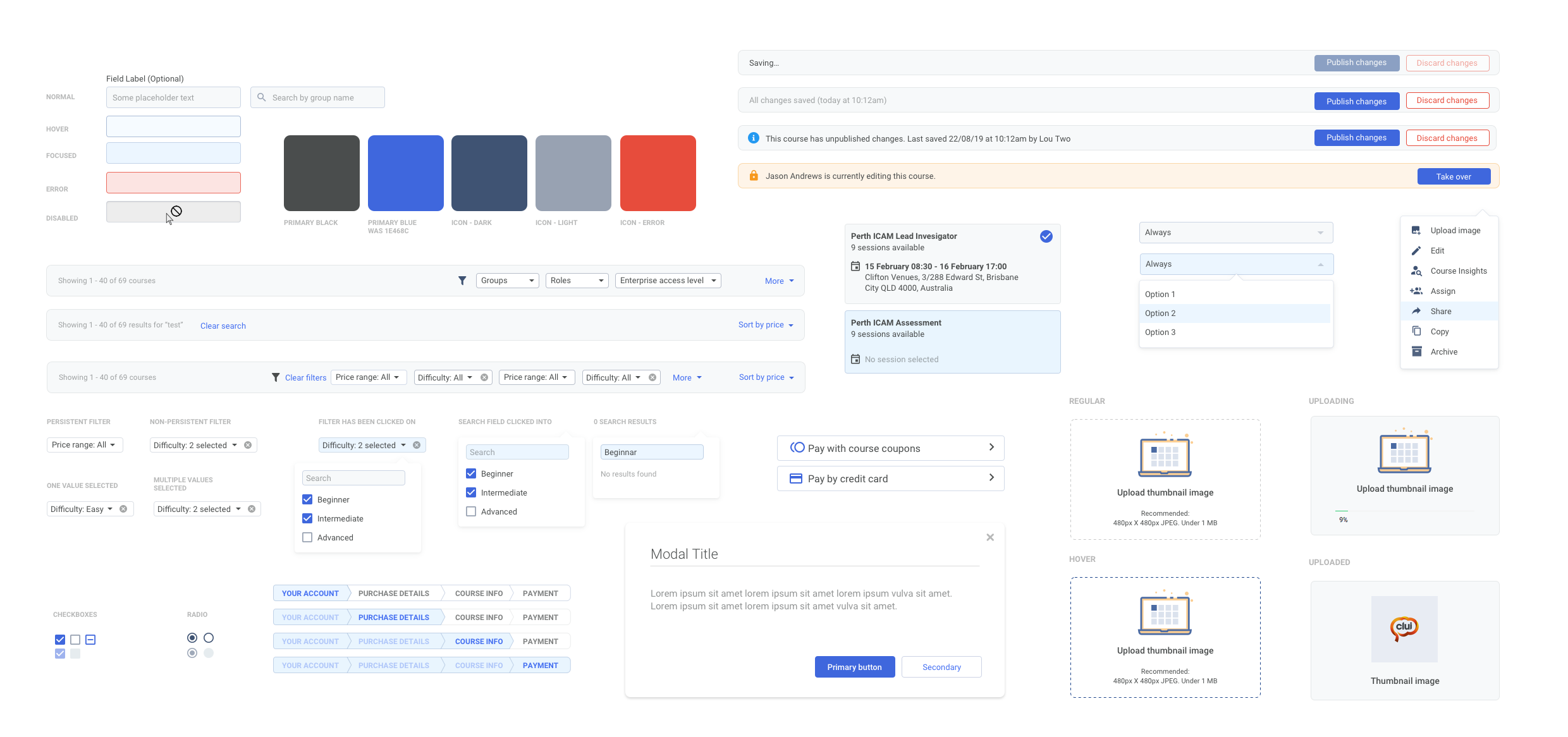
With the help of the front-end designer, I was given a CSS dump of every hex code used in Clui, as well as fonts and sizes. The colour palette audit was easier than expected, as a lot of the colours used were only one or two characters different, meaning there may have been 15 shades of blue which were close enough to be considered one. By looking at the brand of Clui, and the consolidated list of colours, I condensed the colours down to a small amount of main ones, which would then become sass variables, with different opacities able to be used, rather than having hundreds of different hex codes. This was much tidier, and easier to manage – although sass variables may not have been commonly used when Clui was initially designed. The colours were tested and changed throughout the whole design process, and as more components were created, it became easier to decide on a colour palette that would scale across the product.
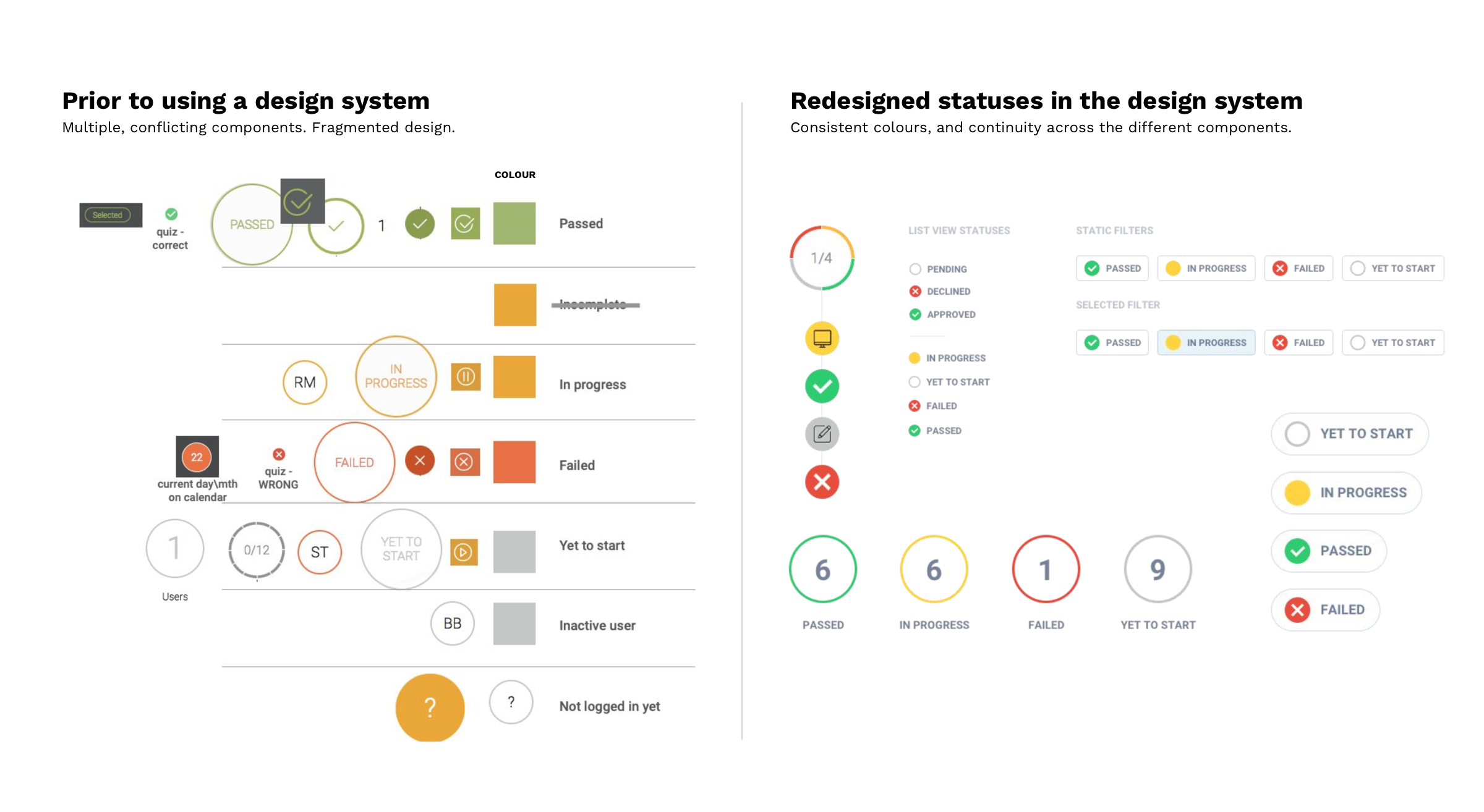
The orange seen throughout Clui, was part of the brand, but also used as a status colour whenever a learner had incomplete course progress. This led to some confusion, as orange meant two different things, and the status colours need to be distinct, as they’re used in so many parts of Clui with a particular meaning. This was resolved by swapping out the overused orange colour for one of the other brand colours, which was more palatable for the UI anyway. The four status colours, for Yet To Start, In Progress, Failed and Passed, were reserved for these purposes, which made them easier to recognise.
Text styles
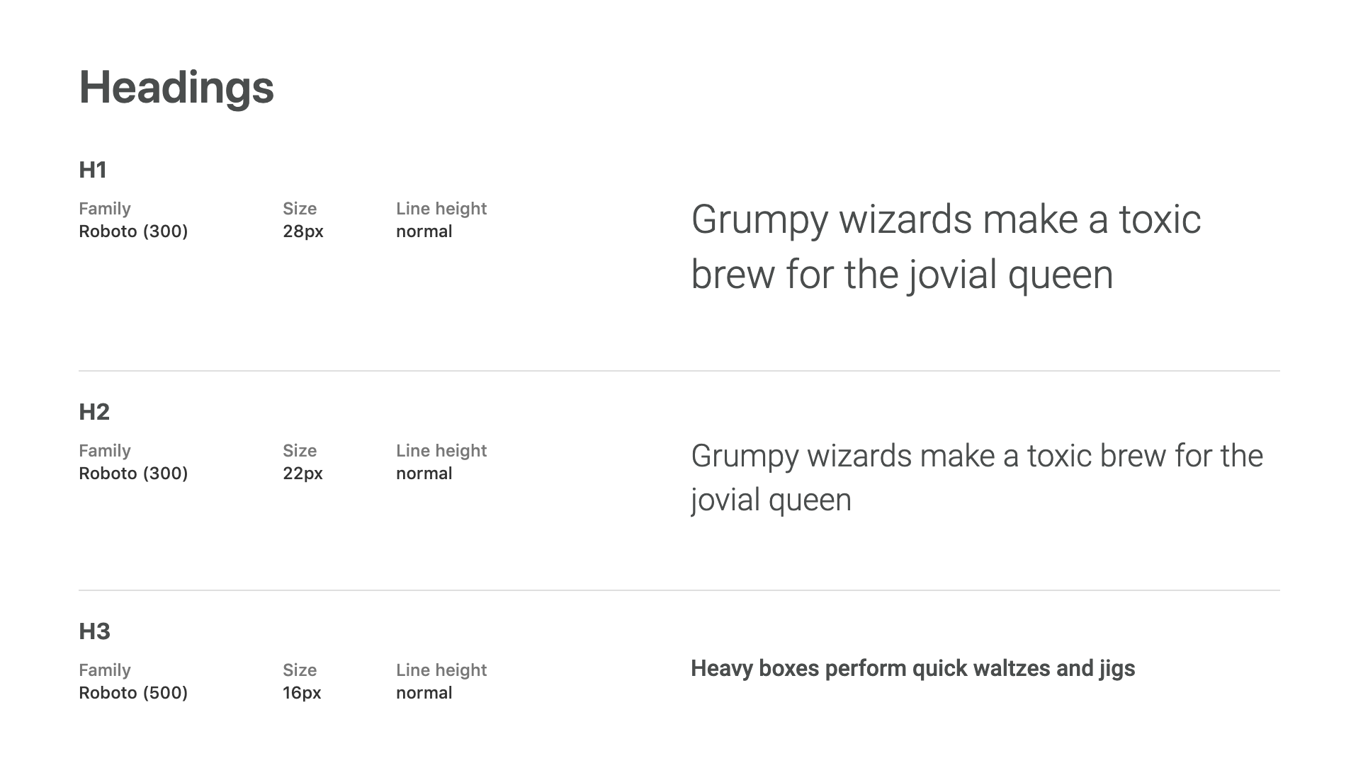
Now that the colours were looking better, it was time to look at the text styles used throughout Clui. Consideration around any changes to text was important, as accessibility and readability were to be prioritised. The text styles were changed throughout the design process as more components were created, and I was able to see what text sizes worked in different places – the idea was to keep it to a minimum selection of heading styles and sizes. I looked at other design systems and learning management systems, to see what design choices they had made, too, including minimum text sizes and what the main text size used was.
Creating a design system with CSS
The style guide was starting to come together, and the benefits were seen, even in the beginning of the project – simply having to build a prototype for a new feature was easier, having pre-built components – even though there was still a lot of work to do on the design system. It was great working in Sketch, but what I really wanted to do was test the styles live, in the product, without needing to create a new instance of Clui and dive deep into the code. Simple things like being able to see what text sizes feel right, in the UI, and what different border radiuses look like…
Enter Stylebot. A Chrome plugin which overrides a website’s CSS with your own. I can’t help but feel this was a very unorthodox method of building a design system, but nothing gave me more confidence in the design decisions and a real feel for how every design attribute felt, than testing it out live, directly on Clui, in the browser. Within a couple of hours I had reskinned parts of the UI entirely. I was able to adjusting padding and margins, colours, fonts, shadows, animations, interactive states, basically anything I would want to change – and with the flick of a toggle, I could compare it with the current design. This was a game-changer, and would go on to drastically change the process for building the design system for Clui, and one that the team was confident in.
I created templates in Stylebot, for each part of the product, which could be switched on and off, including designs for different breakpoints. The idea wasn’t about writing CSS to handover to developers (although it sped up this process a lot, too), it was about writing CSS to improve the look, feel and consistency, and make BETTER decisions quicker. It was a massive timesaver, and made validating assumptions a lot easier, and even paved the way for A\B testing on whole sections of Clui, with a select group of clients.
After the CSS changes were tested out for a couple of weeks and tweaked along the way, it became easier to design the components properly in Sketch. For example, instead of having 4 different types of dropdowns now, all with different padding and inconsistencies, there was one, designed with text, checkboxes, inputs, and icons in mind, and it had been tested and tweaked, and tested some more. Suddenly, what used to be hundreds of different colours, text styles, and components, was becoming an organised collection of artboards, containing types of design components.
Validating the design decisions
Having already worked with clients and hearing feedback on their experience with Clui, prior to the design system project, there were already some ideas on which parts of the interface they liked and disliked, and why. By using a combination of the Stylebot templates, and prototypes, the design decisions were validated internally, as well as with select clients, in order to make sure it felt comfortable, and there was cohesion across the UI.
I was able to publish the Stylebot templates and share them with the rest of the Clui team, so that they could experience the design changes, toggle them on and off as necessary, and comment on how it felt and what the new experience was like. It became an iterative process of making CSS changes, getting more feedback, discussing the design changes, and finally, updating the design system in Sketch.
Managing and documenting the design system
The design system was created in Sketch, with well organised artboards for each category of components, as well as text styles and colours. This was initially created with the Invision Craft plugin, and later turned into a Sketch Library when it became a native feature in Sketch. After some time, Figma was the new design tool of choice, which seemed to be easier to work with, for design systems, and with more continuity working on linked files. It also was more of an all-in-one design tool, without the need for external tools such as Zeplin and Invision, and had better version control options, which would become important with a team of more than one designer.
It was important for each of the parts to have documentation and guidance around the intended usage. Even though the developers could see the attributes for each component, such as margins, padding and so on, it was a good idea to explain why each component existed, and when each colour was used, and when to use button A instead of button B. Creating documentation helped everyone in the team understand the choices that were made, feel more a part of the design, and also prevent misuse or misunderstanding of the parts of the design system.
Having a well documented design system has some pretty obvious benefits, but one of the less-discussed, is the inherent in-depth onboarding when a new designer or developer joins the team. Although I had the tougher task of having to screenshot everything in Clui, ask lots of questions about design decisions made by predecessors, and hunt down hex codes and typeface styles, these tiresome tasks proved their worth, with the creation of a design system that would instantly familiarise a new team member with the product and allow them to hit the ground running, with a complete design toolkit at their disposal.

The short version: Improvements from using the Clui design system
There was always going to be a lot of problems that having the design system would solve, but the most immediate need was being able to do a stocktake on the product and its’ components, and decide on the next steps. Some of the issues the design system resolved include:
• Seeing a bird’s eye view of the product – with years of work, across multiple designers and developers, the design components had never been all laid out before on one page. This was a great opportunity for myself and the team to see “the story so far”, look at what components didn’t quite fit in with the others, identify recurring themes and styles, and decide on what to keep and what to cull.
• Consolidating everything – when you’re handed a list of over 100 hex codes, some only one character different from the last, it becomes clear just how messy the design of a product is. A design system means having a concise list of colours, fonts, components, and rules around each of these, to prevent the component library and codebase from becoming much larger than it needs to be.
• Quicker and easier design work – having a design system means having pre-built components and templates, making it much quicker and easier to push out prototypes, rather than having to start building things from scratch or copying and pasting something from another design file.
• Less guess work when designing new components – It can be daunting working on the UI for a new feature, and not knowing whether to try and reuse an existing component or introduce something new. How will the feature scale and change over time? Should I design the new component with other uses in mind too, to prevent having 100s of small, unnecessary components? Having everything right in front of you and documented, means less guesswork.
• Better developer handover – When it’s time to handover work to developers, nothing gets a better result than documentation and specifications. Having a design system means developers are already familiar with components and specifications, and can easily recall information when they need it, making for less inconsistencies.
• More respect towards design – it can be hard to get a whole product team on board with good design, and understand the importance of design and a quality user experience – this is even more true when working with a product where UX has always been an afterthought. By introducing a well documented design system, it tells the team that design is a priority in the product, and the company, and that it needs to be respected. It wasn’t an easy task getting developers on board with the design system, and introducing a new process into their workflow, but by explaining the benefits for the whole team, and how it would make things easier in the future, everyone began to understand how it would change the product for the better.