
UX Case Study: Simple – Intelligent Marketing Management
The Problem:
Marketing is a complex operation involving various stages. It begins with one or more briefs, collaborated on by multiple teams. Once the briefs are ready, work will be created and assigned to users to complete. When the work is finished and approved, it will be ready to go to market. The problem with this age-old process is fragmentation – marketers have various workflows involving email and spreadsheets. It’s important to have a centralised location for briefing, work, collaboration, and approvals, which is where Simple comes in…
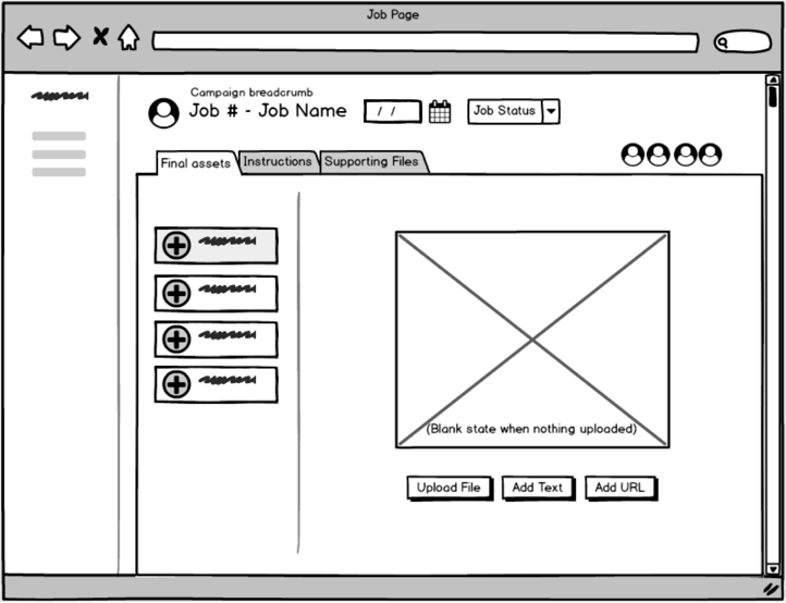
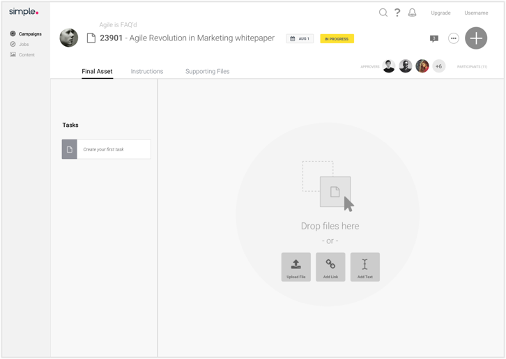
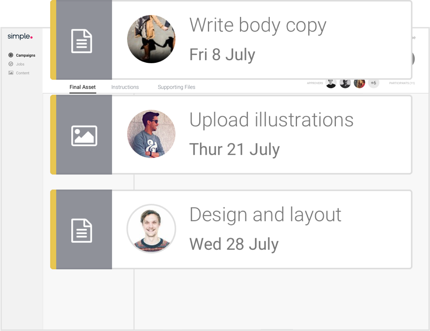
In Simple, Jobs and Tasks is the hub of where the work is created and completed. A job can be a landing page, or a Facebook post, and is split up into smaller tasks so it can be assigned to different users to complete. One task might be to write copy, which is assigned to a copywriter, and another task could be to source photography, which is assigned to the design team. When the work has been done, it’s sent to approvers to look over, comment and annotate on, and approve. Rather than having an inbox full of various versions of assets, briefs scattered on your desktop, and a verbal approval of important campaign assets, Simple houses the end to end process.
User Personas

Marketing Manager
A Marketing Manager has a high level view of marketing activity across an organisation. Their role using Simple is to plan campaigns and request work, and align teams and people who carry out the work. A marketing manager would create jobs and tasks in Simple.

Studio Team
The Studio Team (copywriters, designers etc) manage, prioritise and complete the work. Working under the marketing manager, they will be the team assigned to the tasks.

Approver
Approvers come into Simple and review the output of jobs and tasks to check if it’s on-brand, on-brief and compliant (think terms and conditions, legal requirements, etc).
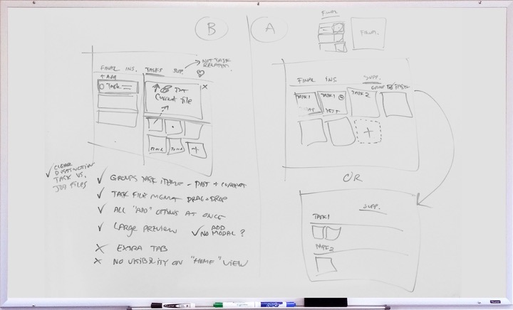
Wireframing
Wireframing is crucial in getting a solid solution together, with minimal gaps. The first stage of solutioning Jobs and Tasks was getting the product managers, designers and even a couple of developers in a room, for various sessions. With the company’s extensive knowledge of user personas and their workflows and pain points, we were able to look at building a scalable solution that would solve the users’ issues, while also accomodating future planned features in the product.
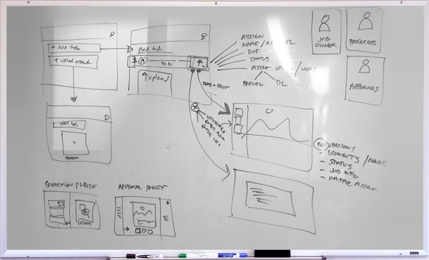
User Journey
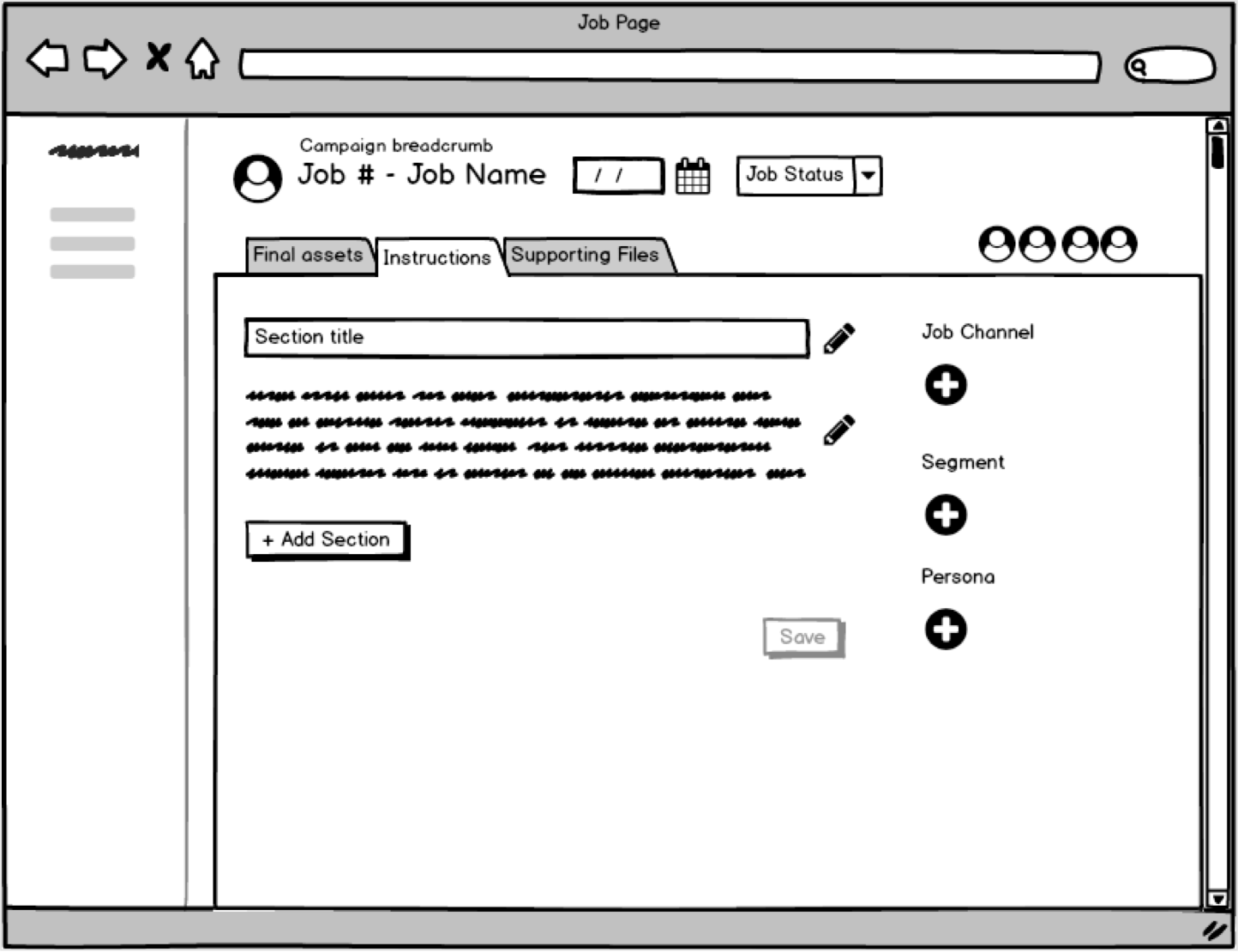
The user journey shows the step-by step interactions each persona goes through in the workflow and when. All of these interactions needed to be catered for in the design, including configuring data in the job and tasks via dropdowns, buttons, modals, datepickers, text fields, etc.

Lo-Fi Designs
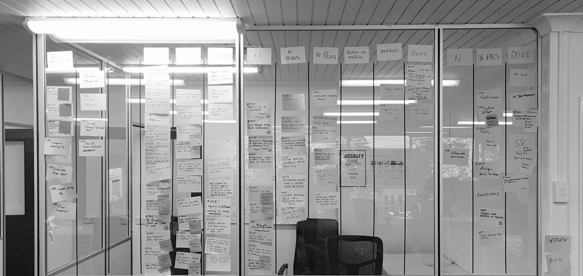
After numerous iterations of wireframing on whiteboards and in Balsamiq, the solution was taken to a low fidelity design level to further surface gaps, highlight usability issues, and get ready for testing with customers to validate the solution. Due to time constraints, it was also important to work closely with developers on communicating the solution so that back-end development could begin. Some of the early issues that arose from working with the lo-fi designs included the target area of a task being too small because of all the elements on it, so users had trouble clicking on a task without accidentally renaming it. The “Create your first task” link in an empty job was found to be too subtle. The coloured status on the left of a task was also too ambiguous and went un-noticed.


Validation and Issues
The lo-fi prototype was tested with existing clients in person, to validate the use cases and get feedback. Solutions were also regularly tested internally. Clients were really happy to be involved in validating the solution and had a lot of insight to offer into the solution. Some of the issues found were…
Inflexible workflow
The solution was found to be a little bit too locked-down and inflexible.
- Approvers have to approve or reject the whole job and use commenting to give context to the rejection, when in reality, they should be able to approve or reject asset by asset.
- Some marketing managers want more control and structure over approvers and their approval due dates. Rather than notifying all approvers of work to be approved, some of them (such as a legal team) don’t need to see it until the creative team, for instance, has approved it, since the work may have numerous iterations before it’s ready for legal to oversee it.
Difficulty knowing what to approve
Approvers need to come into the job, and immediately know what they need to approve. Because everything is sent for approval, there was some confusion around which assets were to be reviewed, and which ones were older versions.
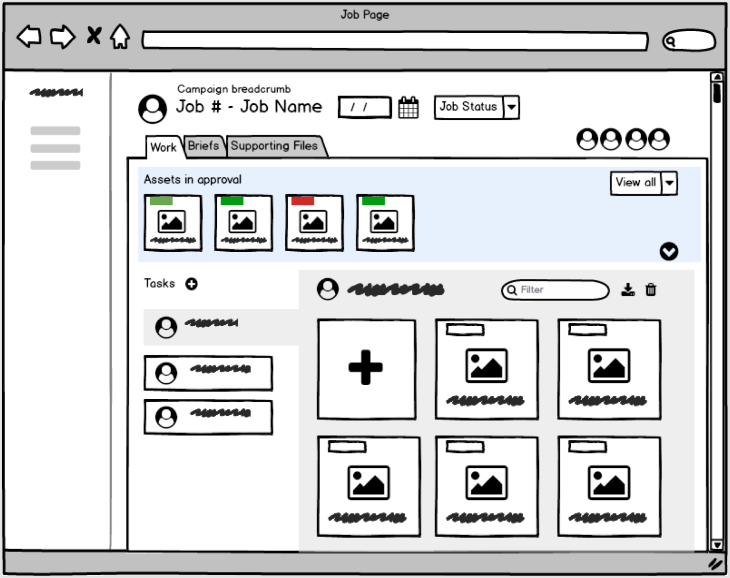
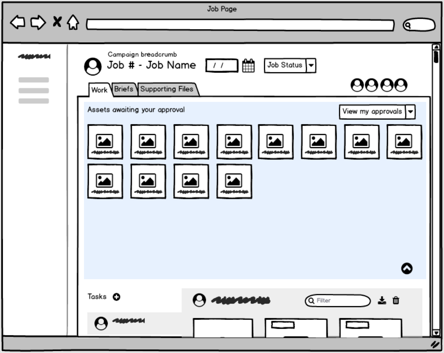
Hierarchy issues
- Users were expecting a separate area for the review process, where assets awaiting approval could be viewed, as well as the approval status.
- There were some issues around the tasks and the asset upload area. Some users did not understand the connection. This was more of a UI issue in order to make it clear the tasks functioned as “tabs” to select which task to work on.
Scalability issues
The carousel\cover flow of assets was difficult to work with. Users had to scroll through all the assets to find the one they were looking for. It was difficult to delete or view assets as well, and had to be done one by one.
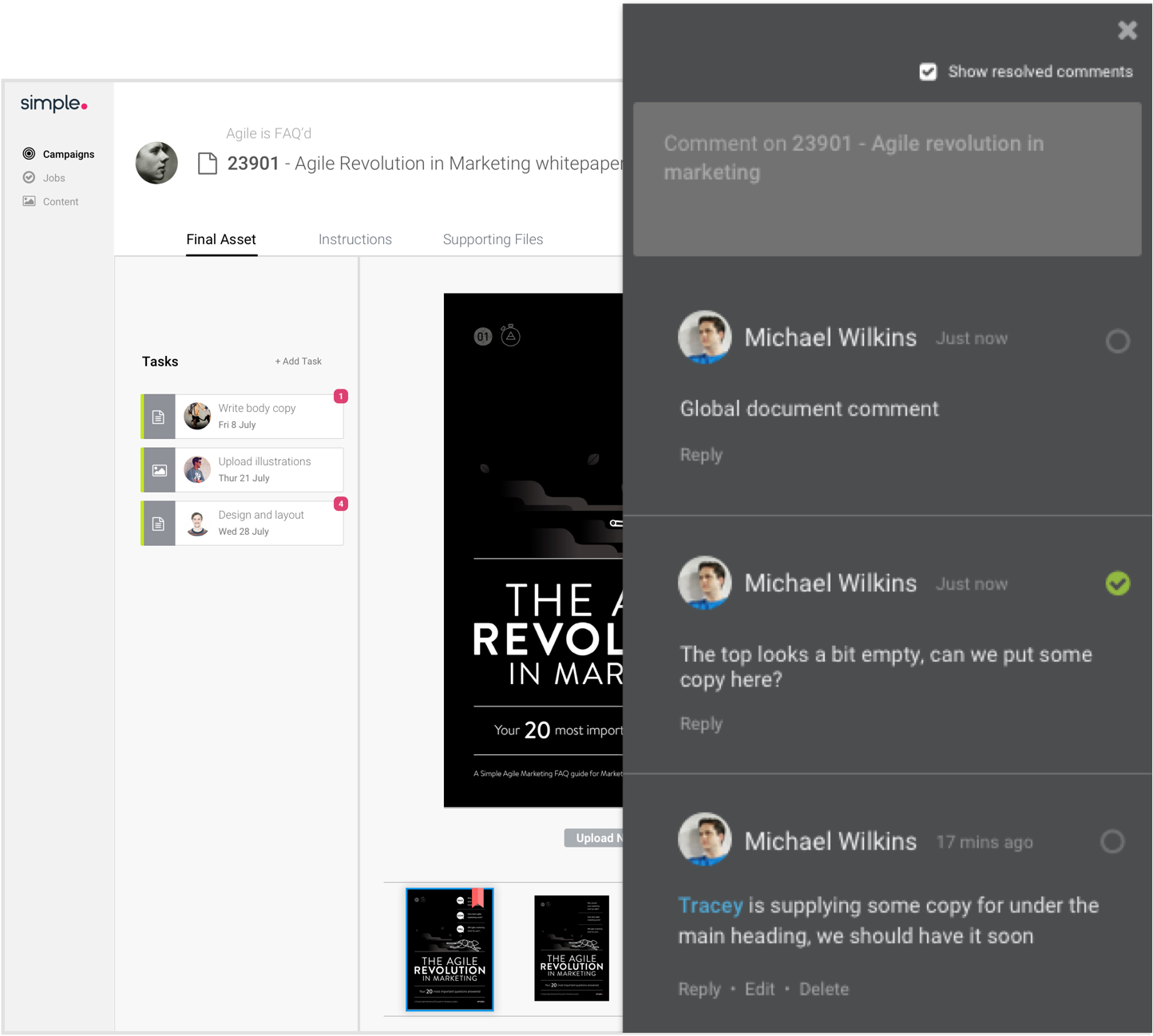
Difficulty collaborating
- There was no separate area for collaboration, it was done in a side panel containing comments for the job
- Comments on assets became cluttered, particularly with PDFs and multi-page documents which could have multiple comments across multiple pages.

Improving the Solution
The feedback received from testing, and further research into how marketers in different industries work, provided lots of avenues to improve across the overall structure and functionality of a job, as well as approval, collaboration, and tasks.
- Marketers work in different ways. The solution needed to be as flexible or as inflexible as they want, but not lock them into working a particular way. The improved solution should give the power and flexibility back to the user to be able to make the product their own.
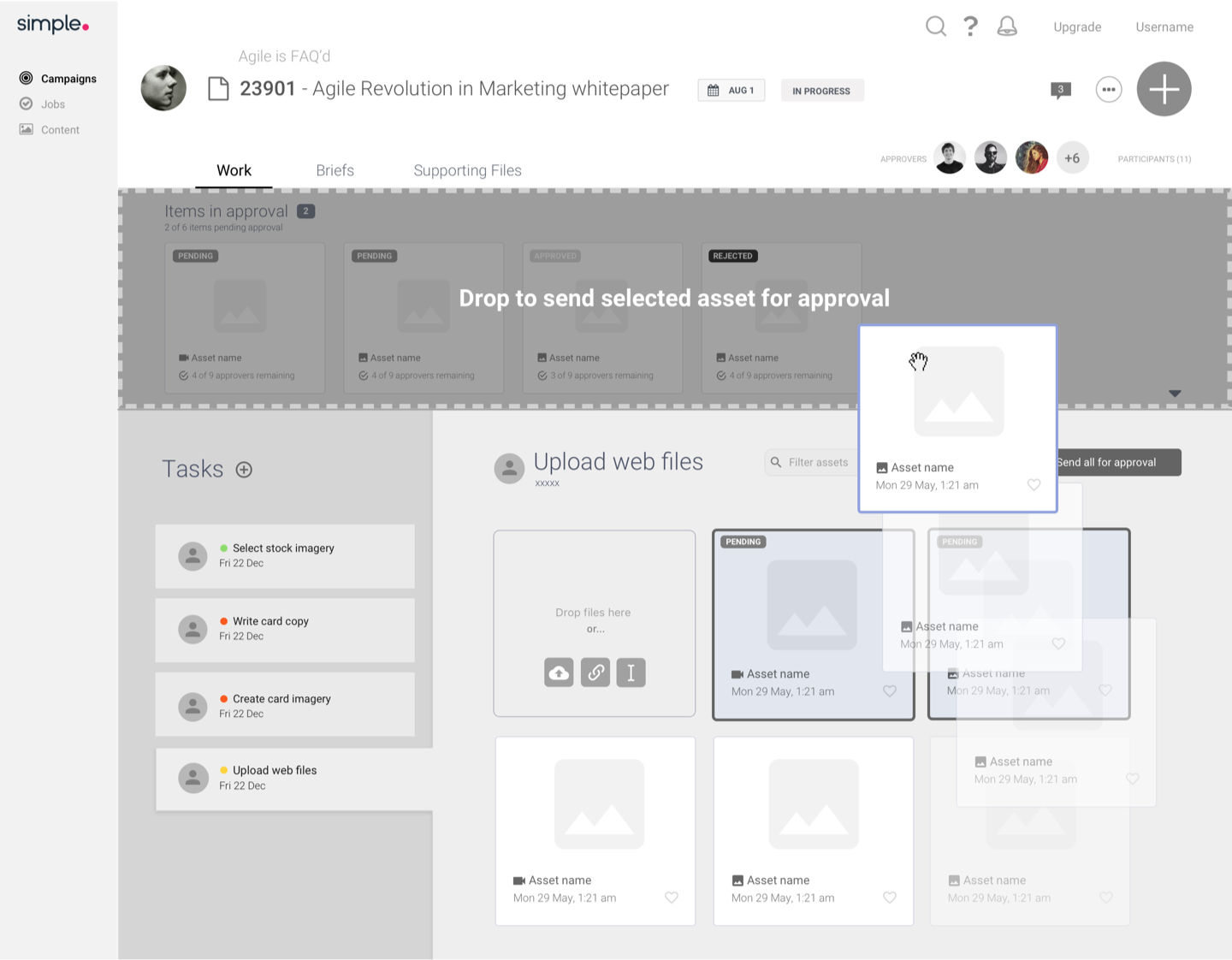
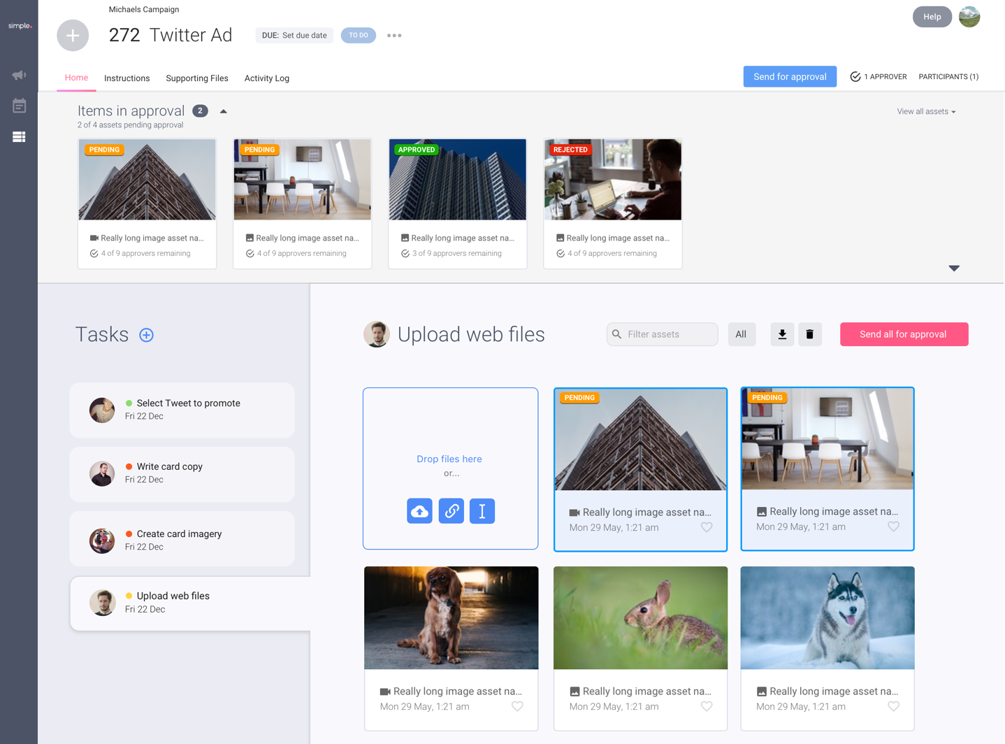
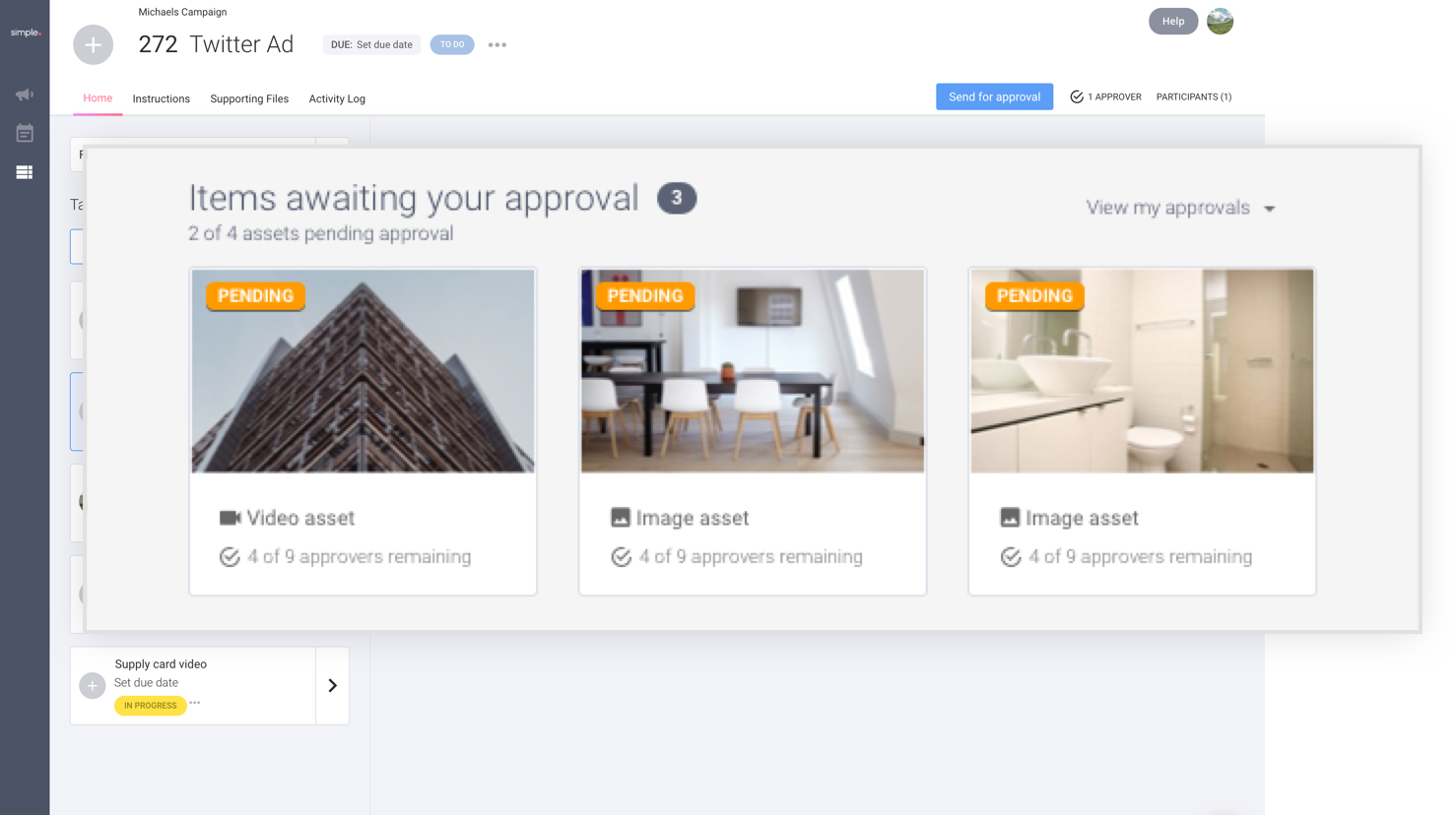
- Approval should be able to work how they want it to, with the option for asset-based approval, or the job as a whole. There should be a clear area where approvers can view assets they need to action, separated from the noise of tasks and working files that aren’t important to them.
- Filtering and view options should limit what the user sees so it’s not an overload of information.
- Marketing involves lots of files and assets, so there should be a scalable solution for managing assets no matter how complex a company’s marketing operations are.
- Jobs and tasks should be simple enough for everyone, but customisable for power users as well
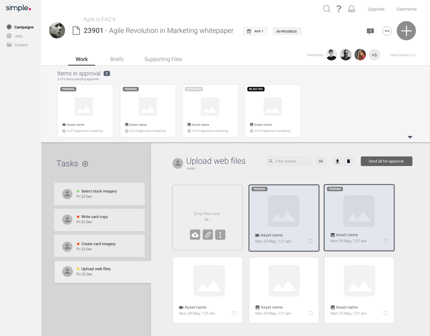
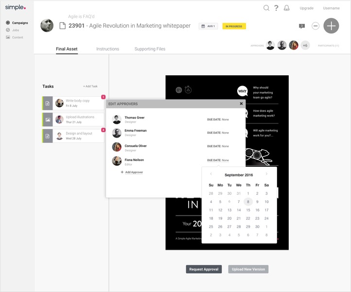
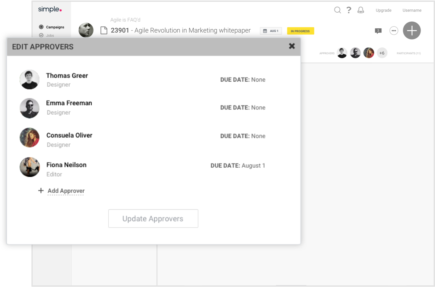
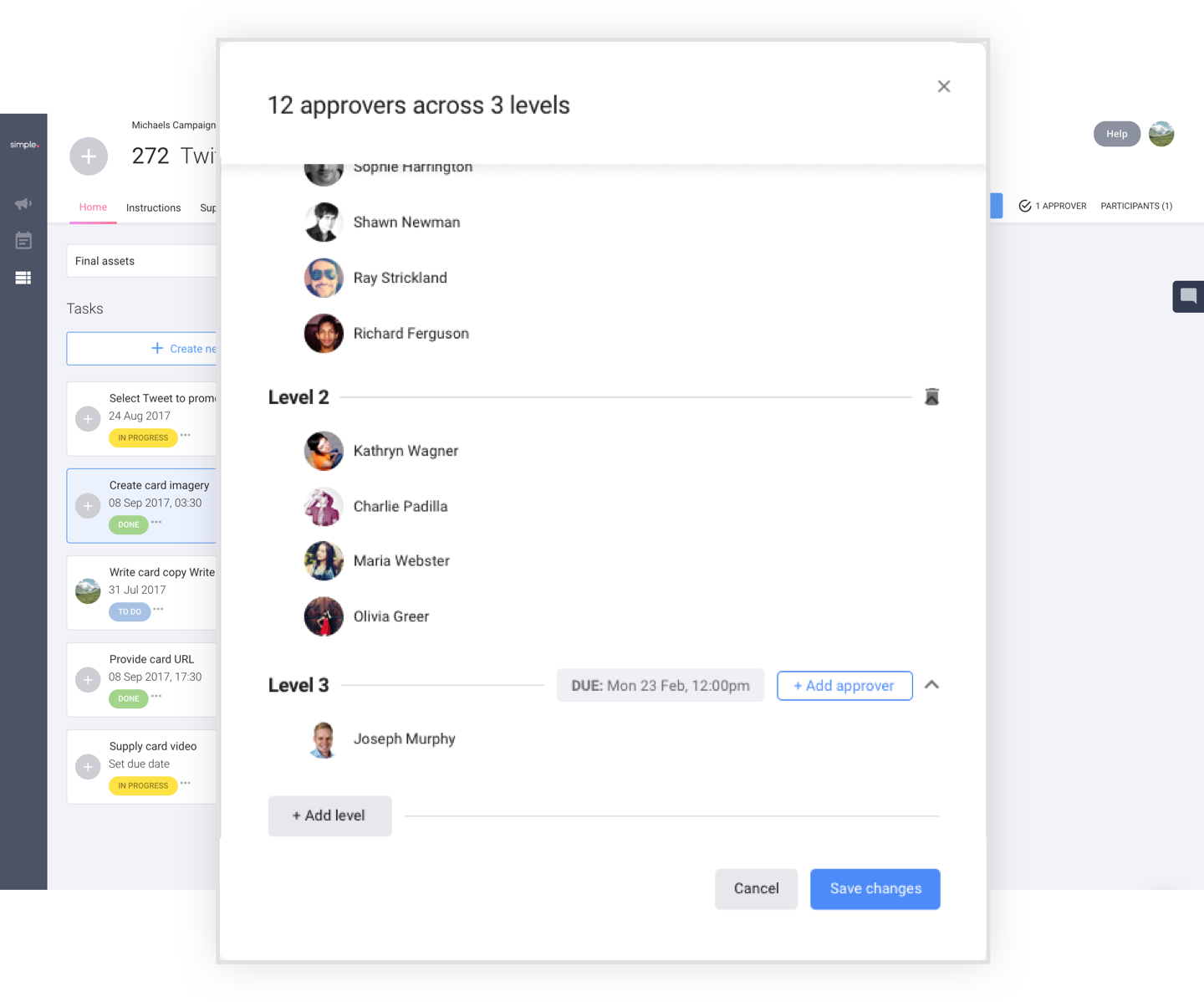
Structured and templated approval process
By allowing users to tier their approval structure, and save it as a reusable template, users can have multi-level approval processes.. so level 2 and 3 won’t have to think about the work until level 1 has approved it.
Approvals in one place
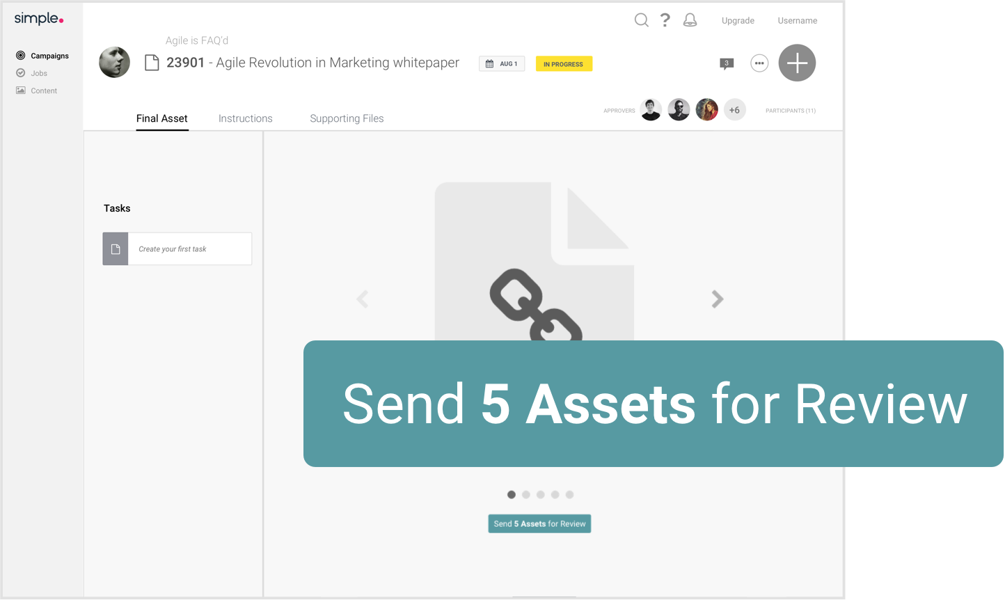
As an approver, you can come into the job and immediately see items you need to approve, and optionally view your approved and rejected assets too.
It’s also much easier for the Studio Team to send work for approval, as they wish, instead of all assets at once. Users can drag assets one by one or multiselect them, to add them to the approval bar.
Easy asset management
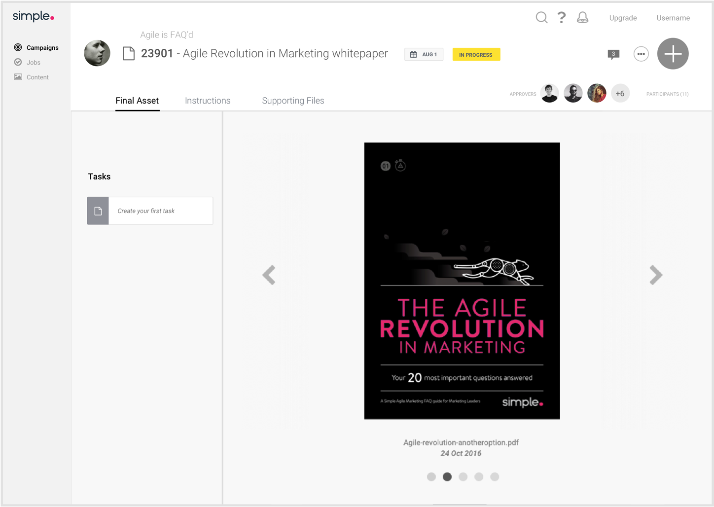
Users no longer have to flick through a carousel one asset at a time to find the one they’re looking for. After looking at best practices from products like Dropbox and Google Drive, there were various patterns which could be leveraged to enhance the user experience when using assets.
Assets that have been sent off for approval are shown at the front of the files with an approval status badge.
Assets can be favourited, shared, downloaded and deleted one or multiple at a time.