

Case Study: YouFoodz Meal Plans
After looking at the YouFoodz Meal Plans pages, as a consumer and also as a designer with fresh eyes on the product, I’ve put together some issues which I think are holding the product back and preventing it from converting as well as it could. This case study is by no means every issue with Meal Plans, but a focus on the more major issues. My aim for the redesign is to make it easier for customers to view what’s in a meal plan, customise their meals, and check out as easily as possible. It should be less disconnected from the regular meal pages that they’re already familiar with.
It needs to be more obvious that meal plans are customiseable
When I first look at a meal plan, I assumed the meals were not customisable – the arrows to change meals feel disconnected from the meal name. The user needs a bit more guidance that they can customise each meal and that they’re not set in stone. I think the term “Meal Plans” already sets this preconceived idea that they come as they are, and that could prevent people from even looking at them, so it will help to have some messaging across the site telling the user that they’re fully changeable.
How this could affect sales
Users might opt to order meals individually, instead of a meal plan. This is much less revenue than a meal plan.
How I’ve resolved this
Placing banners across the site would help with this issue, encouraging users to purchase meal plans instead of individual meals. The banners can also educate and inform the user that the meal plans are customisable. In my design, I’ve added a heading “Customise meals” above the meal selection dropdown.

Meals are cramped up in a very small div
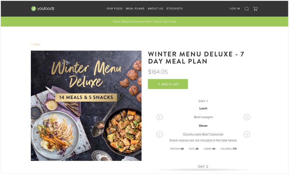
When I’m on a meal plan page (eg. Winter Menu Deluxe), there’s too much content in a small scrollable area. This causes a couple of issues…
Firstly, the giant scroll bar just screams “too hard” or “too much reading” – there’s 5 days (or more) of meals all crammed together with no separation and it just feels like a lot of reading.
Secondly, that little shadow at the end of the div is too subtle, and since I’m using a mac, the scrollbar is hidden unless it’s active, so all I can see is Day 1 – I can’t see that there’s more content when the page initially loads, only when I try to scroll.
Thirdly, if I’m viewing a meal plan with lots of options, such as “Clean & Lean Platinum”, the macros are pushed to the bottom of the list, so if I change any of the meals at the top, I have to scroll up and down to check how the macros have changed. I have a whole browser in front of me and the meals area uses a tiny 500px nested scrolling area. When customising a meal on mobile, it was 10x more tedious.
How this could affect sales
Seeing the food in my meal plan is too difficult, and so is seeing how the macros change when I change a meal. It could make users opt for individual meals instead of meal plans.
How I’ve resolved this
By splitting days into tabs (where applicable) users can see how many days the meal plan has, easily jump from day 7 to day 2, and see macros with ease. This solution works with every meal plan, whether there are 5 days, 7 days, or just a heap of meals.
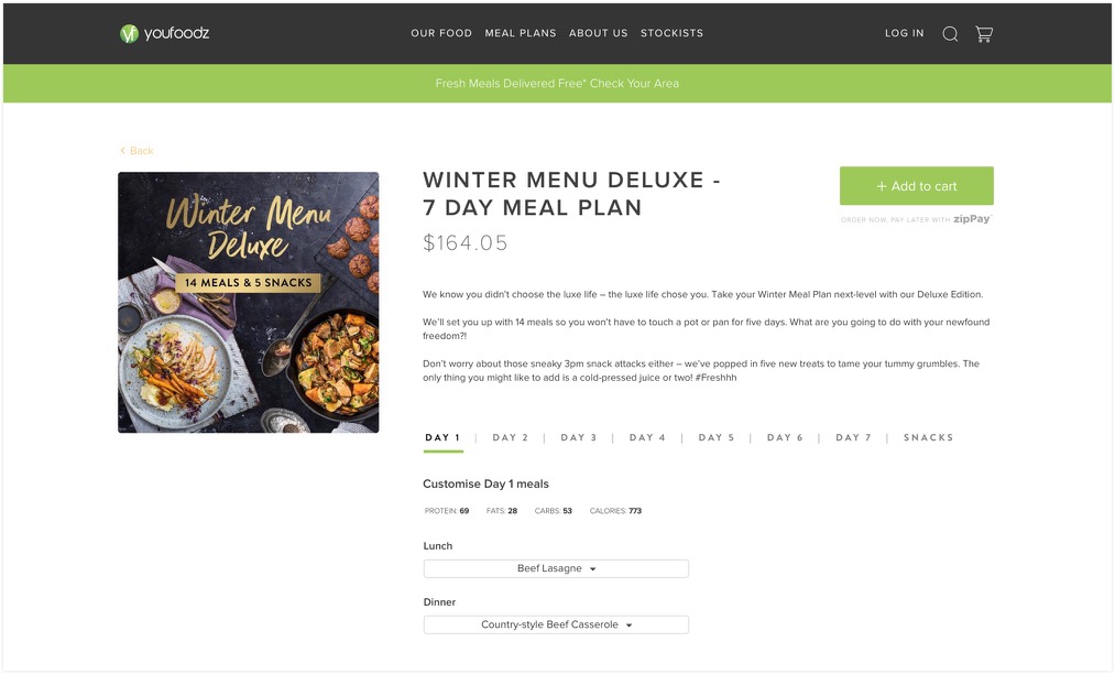
 The current layout of a meal plan page, with all the content hidden in a nested scrolling box
  My redesign, showing days as tabs, with meals in dropdown menus
It’s too difficult to change meals
Changing meals is really difficult. “How many meals do I have to choose from? I’ll just have to click through them all one by one to see all of my choices. I saw lasagne before, how do I get back to it – oh, I have to click through until I find it again.”
How this could affect sales
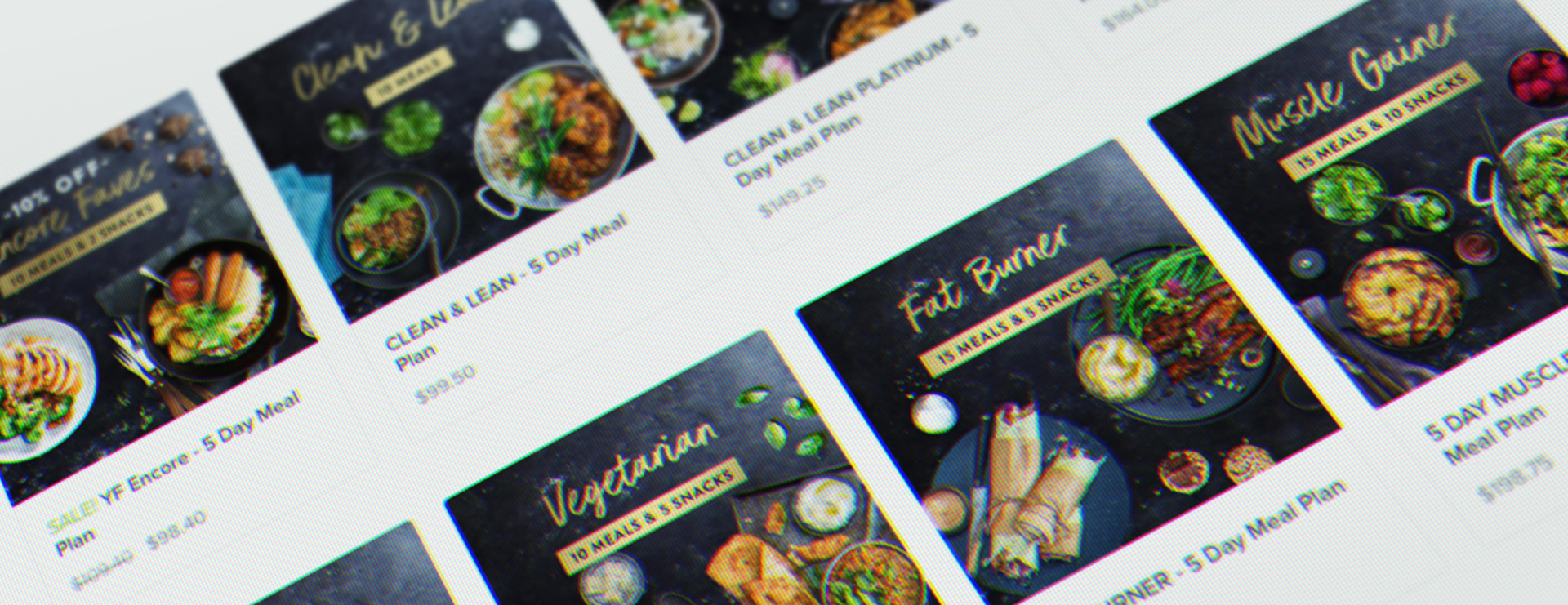
This is one step in the ordering process that feels like it would take up a lot of time. It’s a big pain point. When you look at the Muscle Gainer meal plan, which has 25 meals, customising this meal plan could mean hundreds of clicks. It’s just too difficult.
How I’ve resolved this
To resolve this, meals have been put into a fixed-height dropdown menu – if there are a lot of meals, it will scroll. The dropdown is a much more scalable solution too, with possibilities for searching, sorting and filtering in the future, when there are more meals available to choose from.
 Changing meals is tedious – users are limited to left and right navigation arrows
 Customising a meal plan is much easier with meals listed in a dropdown menu
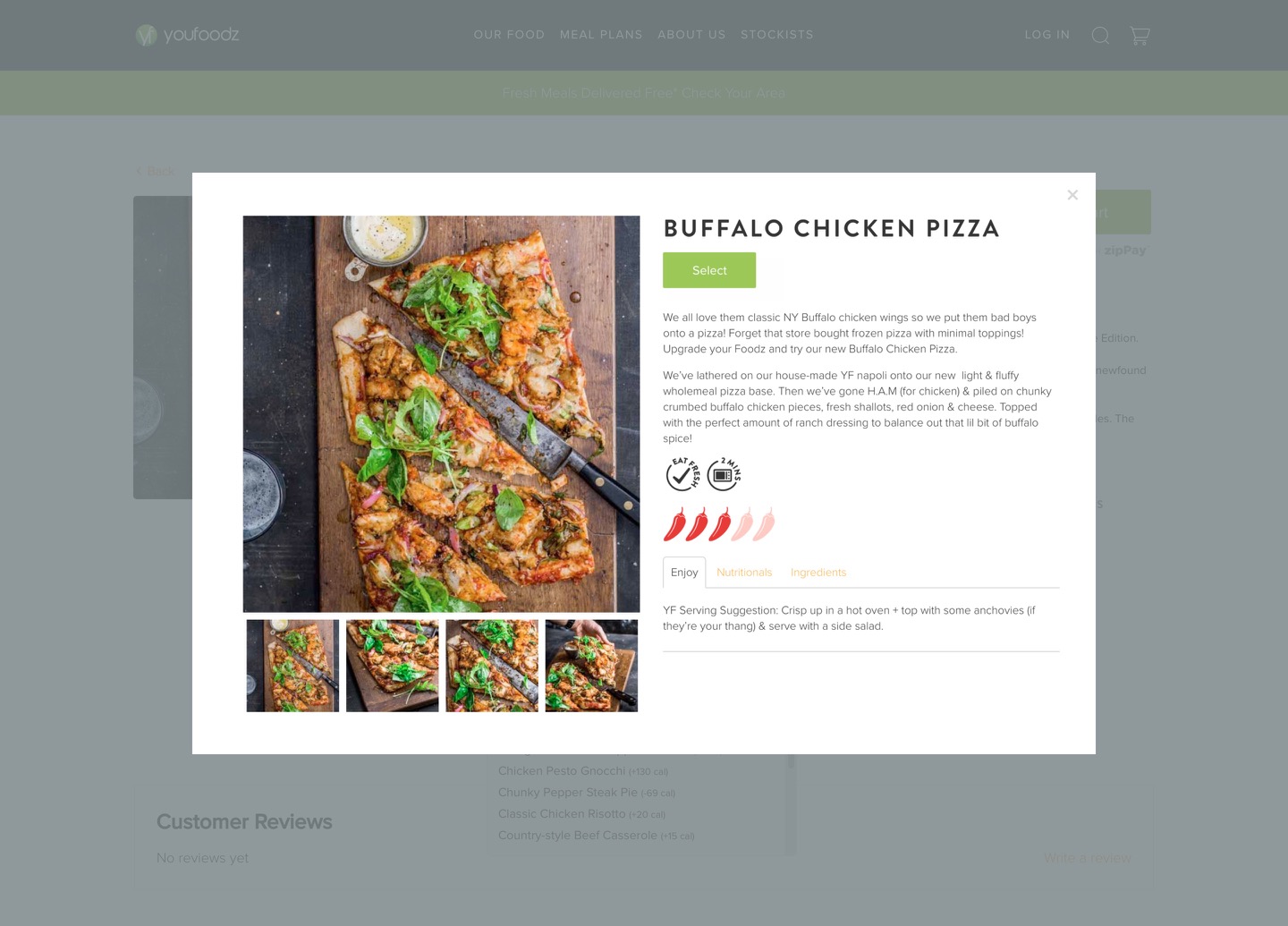
Viewing more info on a meal opens a new tab
It’s too hard to see images of the meals and what they look like. The users wants to see more information about a meal, but clicking it opens a new browser tab and takes them away from a $200 sale. This could result in a heap of tabs being open, and the user getting lost in information.
How this could affect sales
Don’t take the customer away from a sale. You want them to click ‘add to cart’ and checkout ASAP, so opening new tabs feels like a huge no. It’s a distraction, and they’re likely to just go and buy individual meals instead of the meal plan – by literally pushing them to the individual meal page! Secondly, it’s tedious – even if the meal plan only has 5 or 6 different meals in it, it’s still unnecessary opening the meal in a new tab when there are more intuitive ways to show the information, such as a modal.
How I’ve resolved this
When the user hovers on a meal in the menu, the thumbnail updates to show a preview of the meal, and the daily macros update too. The product page has a huge image area and it feels like a waste to not use this better. The user can also see the difference in calories next to each meal name, without having to click it. If they want to view the full meal page, they simply click the info icon (which shows on hover), to open the info in a modal. From here they can either close the modal, or hit select to select it.
 When hovering on a meal, the thumbnail and daily macros update
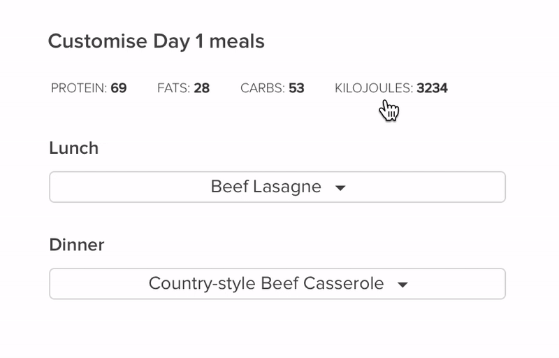
Macros matter! Stop hiding them
Users have to choose every meal one by one to see the macros update. They should be able to easily see how a meal change will affect their daily macros. Take a look at the Muscle Gainer meal plan – someone buying this plan will likely obsess over the macros, and they can’t even see them update when changing breakfast or snack 1, since macros are out of view.
How this could affect sales
Macros are a pain to calculate manually, so this is a huge selling point for YouFoodz, giving the user this information upfront – so make it as accessible as possible. There are likely some customer personas who heavily base their meal selection around macros, and it’s a big point of difference from competitors, making them accessible.
How I’ve resolved this
No matter how many meals there are in the meal plan, macros won’t get lost now that the content doesn’t need to scroll. In addition to this, meals in the dropdown menu will show the difference in calories; it would even be beneficial to test if users want to see macros for each meal in the menu itself (carbs, protein, etc).
Some meal plans have five meals a day, and push the macros out of view in the current designGive users the option to use kilojoules
Some users work with kilojoules, not calories, and having to use a convertor is fiddly.
How this could affect sales
Nearly every country on the planet officially uses kilojoules – it’s also the primary measurement on all Australian product labels and in restaurants and cafes. Give the user the choice, and it will make their meal planning a lot easier.
How I’ve resolved this
Clicking anywhere in the macros will toggle between calories and kilojoules. This should be a site-wide setting, so the user only has to do it once, and the site remembers their choice.
 Calories and Kilojoules can be switched by clicking anywhere on the macros
Before and after
Aesthetic changes
- I’ve moved the meal plan description to the top. This is currently a hierarchy issue, and users want to read about the meal plan before customising it.
- The “use the arrows to customise” text in the current design shouldn’t be needed if the design is intuitive enough.
- “SALE” text is in red, like it’s a bad thing! I have changed it to green, although some kind of overlay on the thumbnail would be more effective.
- I have used rounded corners on the product images – it’s a subtle change, but an improvement.
Further consideration
-
Everything in these concepts needs to be tested and validated, which would normally be an important part of my process. This is more of a first look, without knowing the users and how they use the website.
-
It might be beneficial to show the original selection for a meal (eg. for lunch on day 1) or let the user revert back to the default selections for a meal plan, without having to refresh the page.
-
With the empty space under the meal plan image, the page could show the meal macros or nutritional information on hover, or more thumbnail images.
-
Favouriting meals could be a very useful feature, and help users easily select their favourite meals in a meal plan by giving them a different treatment in the dropdown.
-
The modal, on a meal plan page, could have left and right navigation arrows to navigate through meals in detail, before selecting one – like a carousel.