

Case Study: Crafting a Learning Management System (LMS)
Clui is an online Learning Management System (LMS) used to create, distribute and manage learning content. Clui began as a small product, delivering training to a single company. It was designed by a graphic designer, with very limited consideration for user experience and user interface best practices. This led to problems such as an overuse of modals, a fragmented design system with inconsistent UI components and design patterns, a poor mobile experience, and an overall confusing, unintuitive product.

Earlier in 2020, a mutual decision between Clui and one of the longest-standing clients was made for them to find a new LMS provider as Clui was no longer able to support certain reporting functionalities due to changes made by an external reporting authority. The client began looking into other LMS providers, but after some time, requested to continue using Clui with a workaround solution to the functionality limitation.
One of the key reasons for this decision was Clui’s focus on user experience design. The client stated that Clui’s decision to invest in the UX of the product, by means of hiring a dedicated product designer a couple of years ago, was the very best decision the company could have made. Thanks to this, the client believes our LMS platform is more user-friendly, intuitive and functional than the many competing products.

Clui’s three distinct use cases..
• Simplify compliance – companies create a Clui account, set up their courses, then manage inductions and training records, to ensure their staff are compliant in a particular field (eg. mining or construction).
• Sell courses – Offering public access to paid courses, as a business. For example, Australian company Safetywise sells ICAM training (Incident Cause Analysis Method) which is used in an array of industries including aviation, mining, rail and security.
• Integrate – Clui offers a white-labelled API-based product for integration with existing SaaS products. For example, a company may already have a product used for inductions, but want to use API calls to Clui, within their product, to initiate training.
My role in the Clui team
My first year at Clui was filled with challenges – the Product Owner had just left, and it was up to me to take on management duties and create processes for the team, such as creating a roadmap for the product, running sprint sizing and retrospective meetings, and prioritising the backlog.
By improving relationships with clients, and running regular validation meetings, I was able to find out how the product was actually being used, and which features and improvements needed to be worked on first. For example, I learned that a number of larger clients had automation workflows being used for common tasks, and it was less important to work on some of the features which required manual input (eg. adding a user by typing their details in) than improving the handling of importing users from a spreadsheet.
Due to rapid growth in the earlier years of Clui, combined with poor product management, features were implemented at the drop of a hat, with no consideration for product-market fit, or proper design and validation process. There was no strategy, no roadmap, and everything was built for the present, without any thought for scalability or long term use cases.
While learning about the target personas of Clui and their pain points and needs, I put together a list of new features for the roadmap, as well as problem areas which needed to first be resolved. The main problems in Clui were related to two main themes: Poor usability, and lack of scalability. This case study walks through a number of design and usability issues in the product, and how I helped remove them from Clui.
Problems within Clui
Overuse of modals throughout the product
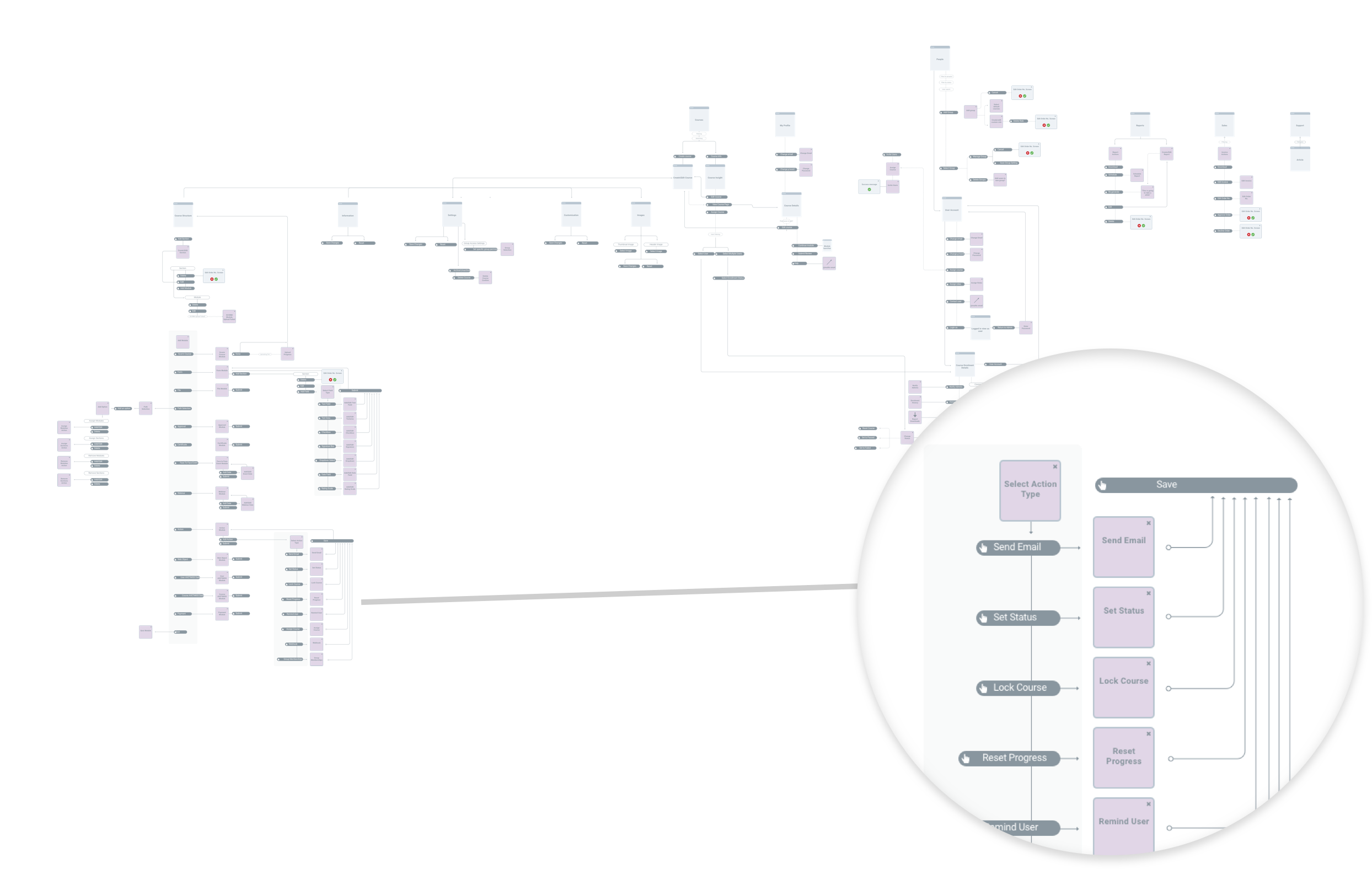
Many parts of Clui were built within modals, to the point where very little of the product was presented in a main window. This led to problems such as nested modals, lots of content being shown in a small space, confusing navigation, and difficulty adapting content to mobile breakpoints.
By creating a sitemap, I was able to do a stocktake on the product, look at the different ways content was shown on screen, find alternatives to using modals and consolidating the amount of screens used. The navigation was also improved, so users could easily see where they were within the user flow, and titles and descriptions were provided to explain what the user needed to do to progress.
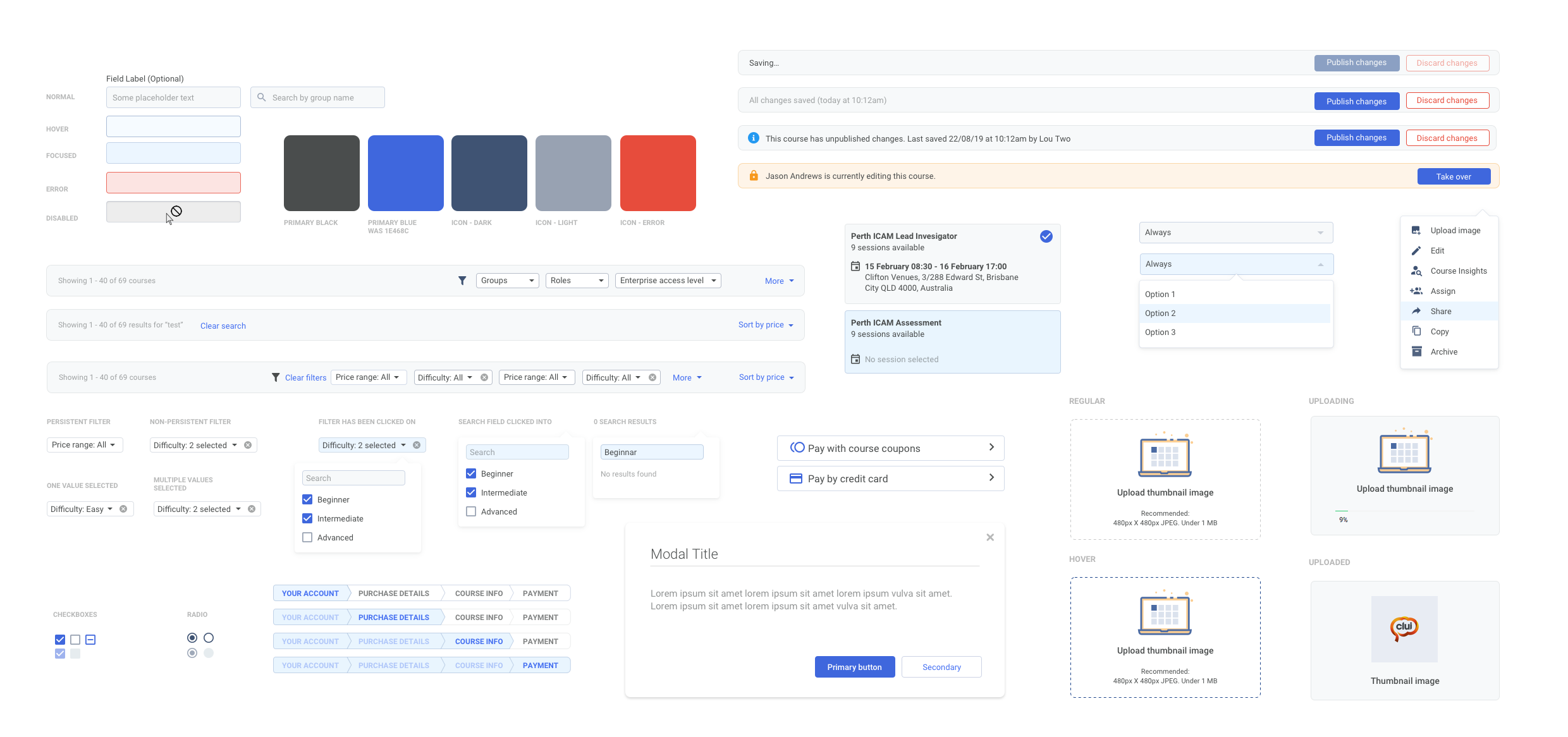
No design system
As Clui went through the hands of various designers, and was built without a design system, the UI became fragmented, with multiple appearances and different functionality for the same component. This meant that a dropdown menu in one part of the product might look completely different in another part, and was hard to manage in the backend as well.
By performing an audit on the UI and working closely with the frontend developers, I was able to consolidate the components, colours and text styles, so there were no unnecessary styles used. I created a style guide with Sketch, and documented it to explain the purpose and functionality of each component.
Poor choice of colour scheme
Clui was designed by a graphic designer, piece by piece as features were needed, without a proper design system or consideration for scalability, accessibility or ease of use. There were also colours used throughout the product with multiple meanings, leading to further confusion.
By swapping out the dark, unwelcoming interface with a lighter one, it instantly made Clui feel more intuitive, familiar and friendly. I used CSS to override the default colours and test a new colour palette to ensure it worked everywhere. Statuses were recreated with a small palette of colours, preventing any confusion around what each of the colours meant.

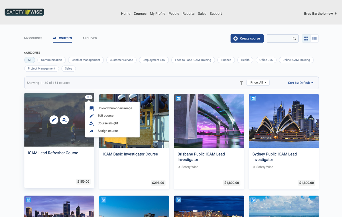
Oversimplified Courses page
The Courses page is the front page of a Learning Space, and needs to entice learners to action their training, or buy a course; but the functionality of this page was very limited, and the UI needed work. In order to perform basic actions, learners and admins needed to click into a course, and there was no information shown on each of the courses other than the name of the course.
The redesign of this page was one of the most drastic improvements in the product. By adding functionality such as a course actions menu, providing more information on the courses, and redesigning the course tiles to look nicer, the page became a lot more enjoyable and easier to use. Admins now have more control over how the page looks, such as reordering courses, and learners have more information on each of the courses, to find the one they’re looking for more easily.
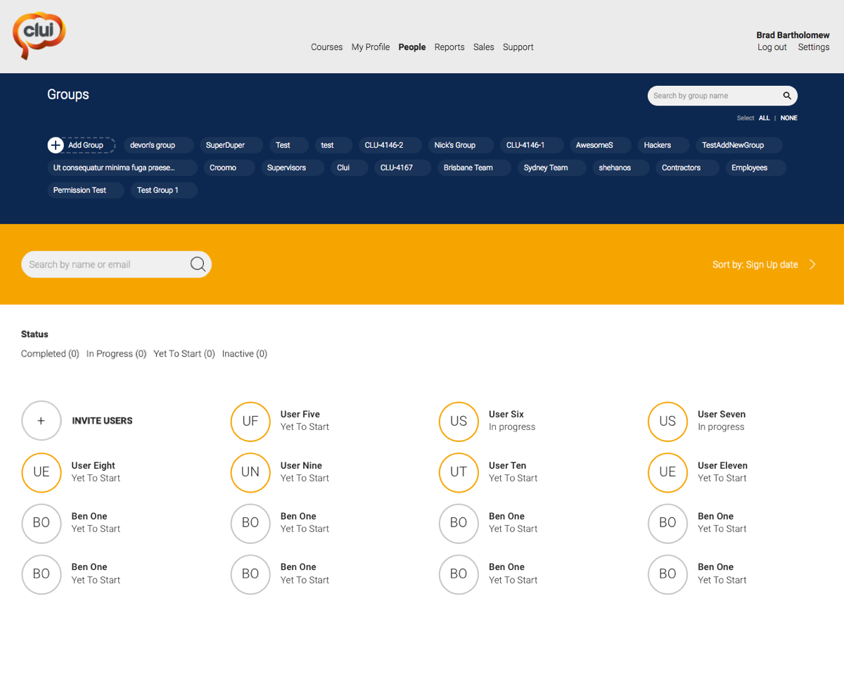

Non-scalable People page
In Clui, the People page is a list of all the user’s belonging to a learning space, showing their information and learning progress. This page was very dysfunctional and needed a lot of work to be usable for large amounts of users – there was very little data shown, and the layout was not scalable at all.
The new list format was introduced across multiple pages in Clui, and had the biggest impact on the People page. Rather than showing users in a grid format, they’re now shown in a list – a common UI pattern – which enabled sorting, filtering, multi-select, viewing higher information density, showing contextual actions and more. It’s now also easier for the user to scan for information vertically, rather than in a grid format, and allows for a more consistent experience across breakpoints.
Unintuitive features
As Clui grew from a simple product into a more feature-rich one, it was no longer as intuitive and easy to use. It also became more important than ever for Clui to be self-serve, and intuitive, as the list of clients grew, and it was difficult to perform hands on training with each client.
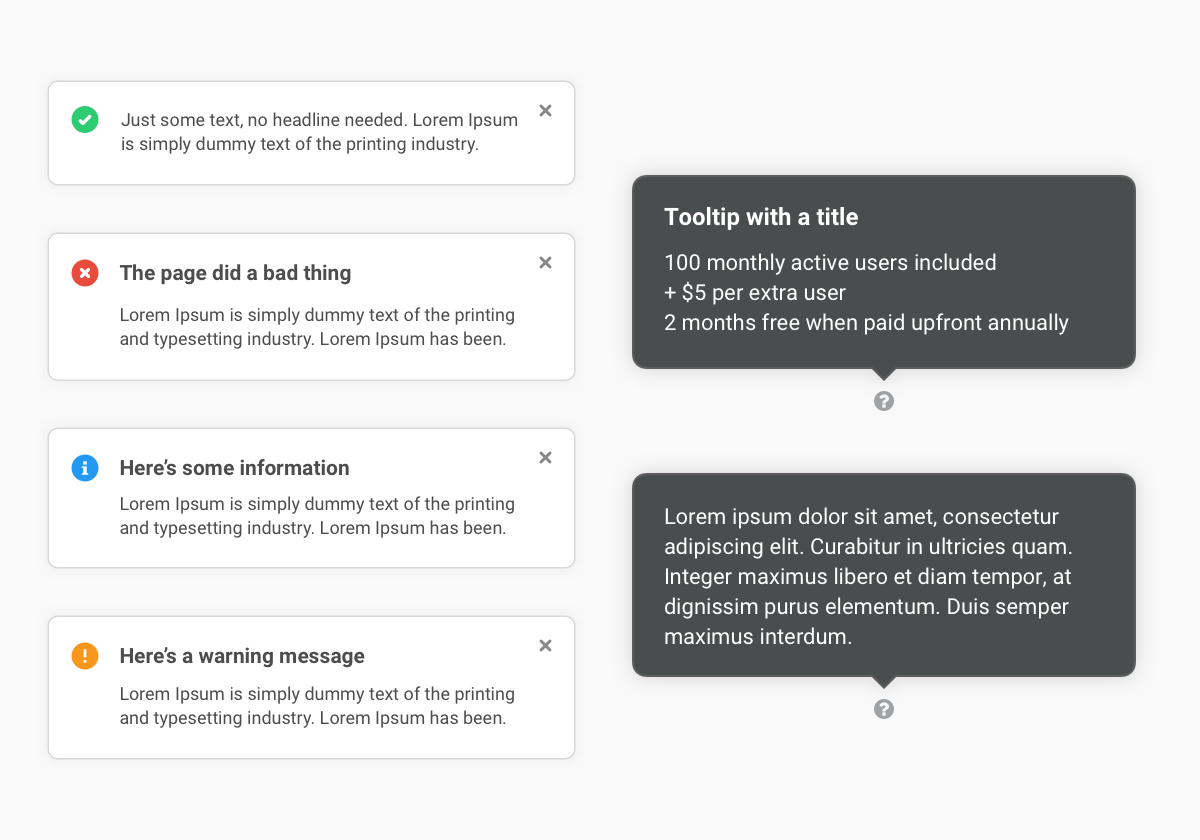
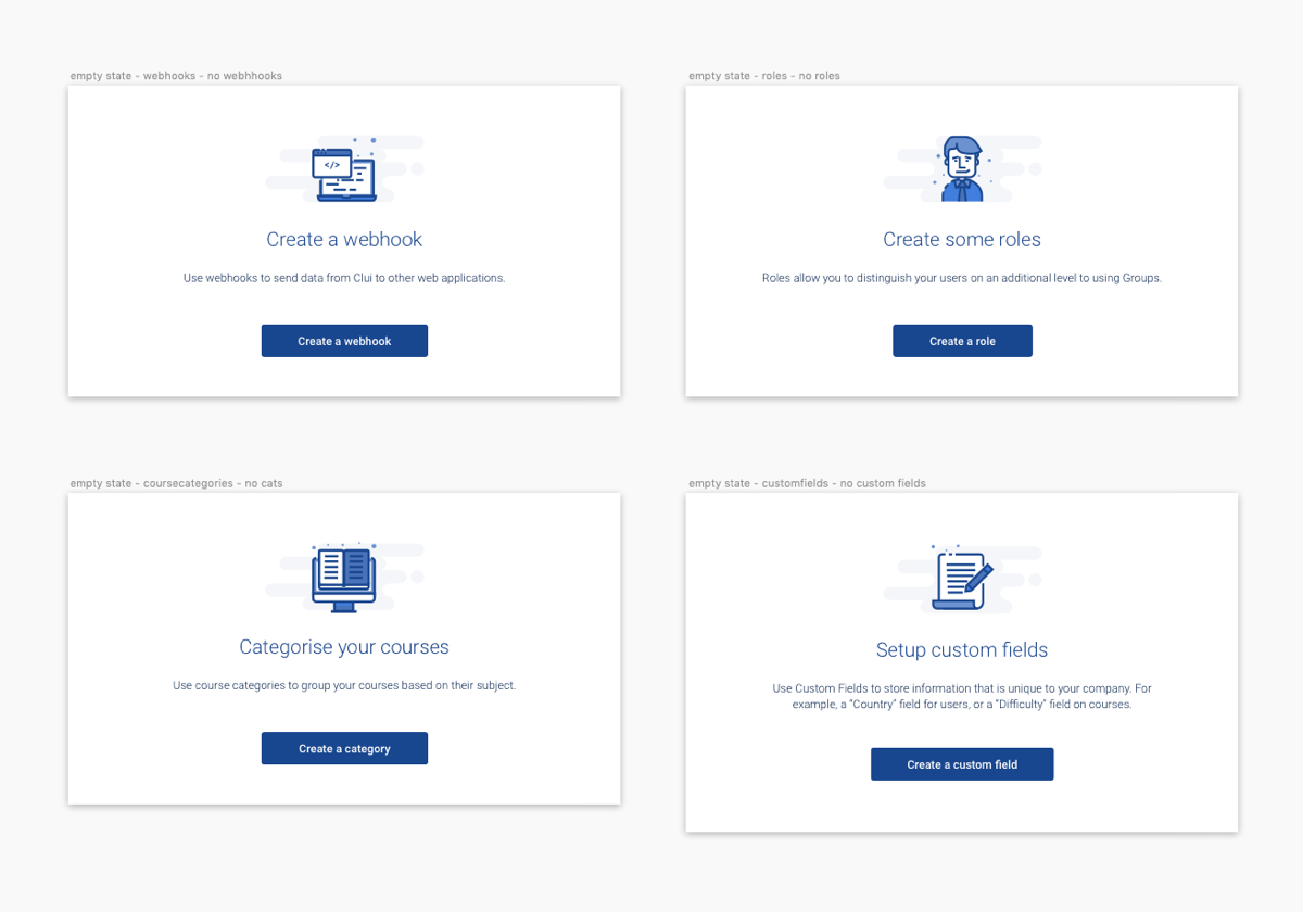
By introducing helpful devices throughout the product, such as tooltips, and stripping back the interface to make it less complex, as well as building a more detailed help centre, Clui became much easier and more enjoyable to use, with less problems for support staff to deal with.
Onboarding introduces users to different sections of the product, and the most used features within them. Tooltips and contextual help explain different functionality. Empty states and error messaging were provided in all parts of Clui, to give the user direction and help them. Finally, notifications were designed to give feedback on actions and events, such as errors and warning messages.

Minimal filtering and customisability
Clui’s basic filtering and lack of custom attributes made it hard to manage objects such as Courses and Users. Many software applications, such as Jira, enable users to create custom fields, which contain a value, useful for searching and filtering.
Adding custom fields in Clui meant users could create a number of fields, and store a whole range of data on their users, which could then be reported on, making Clui a very effective tool for people management, too. It became easier for learners to view more information on courses, with added information such as course difficulty, completion time, course topics, and so on. By introducing a filter bar device across the product, users can filter by multiple values, in order to cut down the time taken to find something – and Clui became a much more viable option for enterprise clients, with large scale needs.
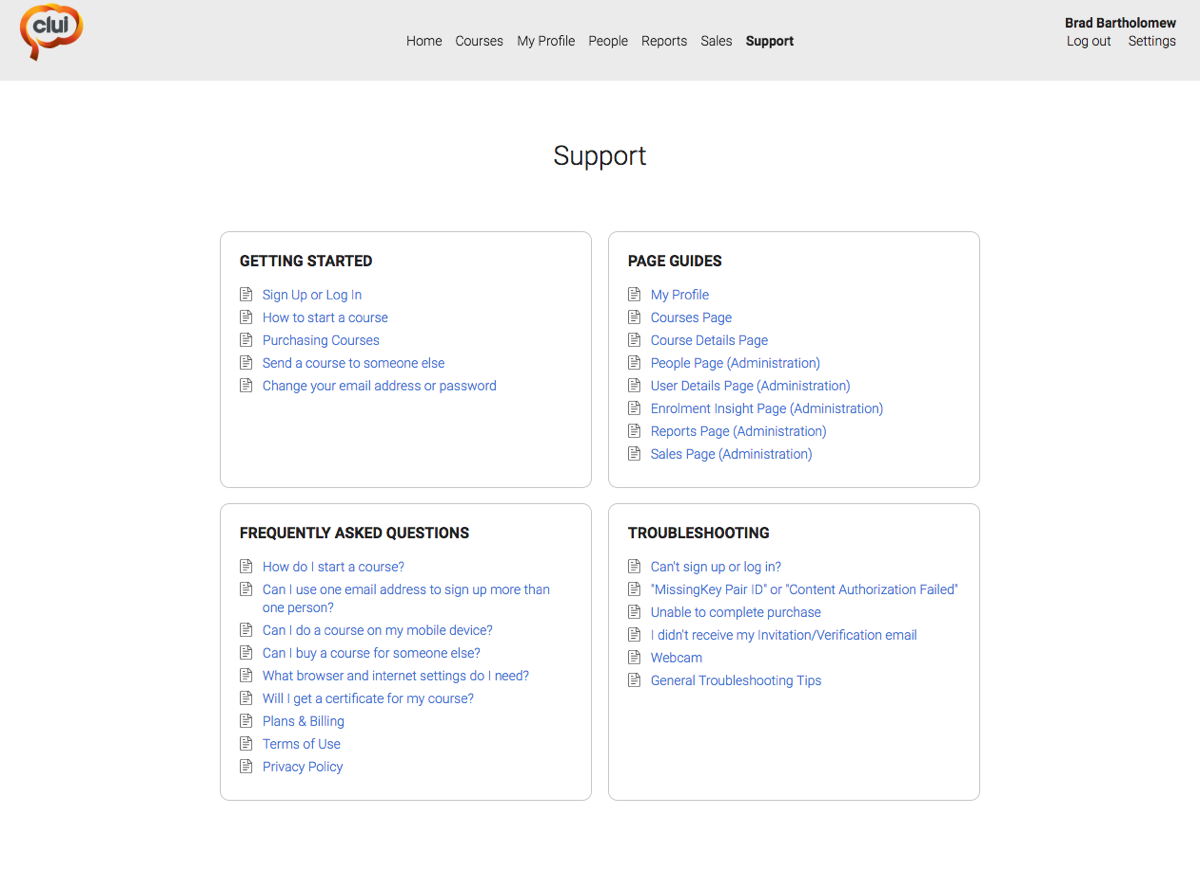
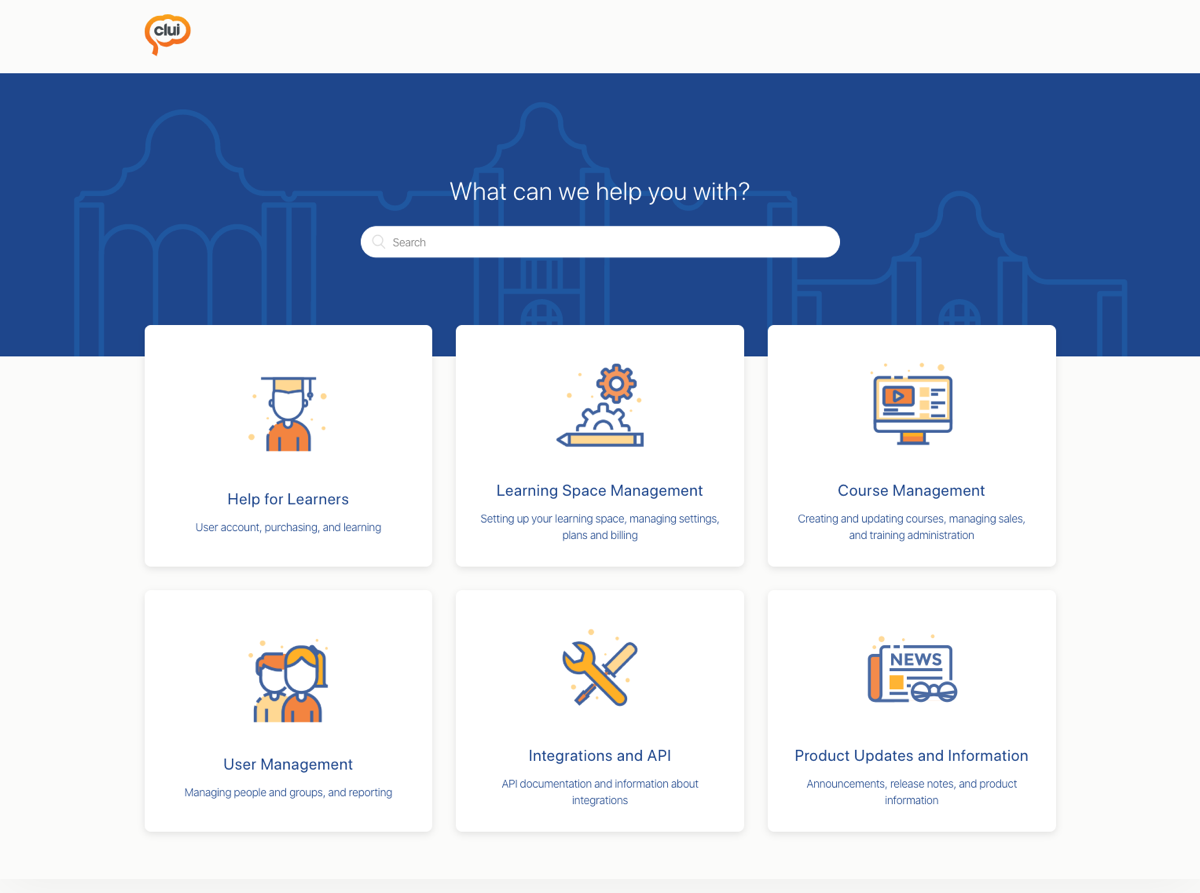
Inadequate support centre
Clui’s help centre and support was managed in Groove, which was unintuitive, and the content was not very engaging. By migrating support and the help centre to Zendesk and providing a larger range of help content, the help centre became easier to use, easier for the product team to maintain, and the company saw a reduction in support requests. There was also a lot more functionality around automation, making it easy to automate common processes such as replying to support tickets.
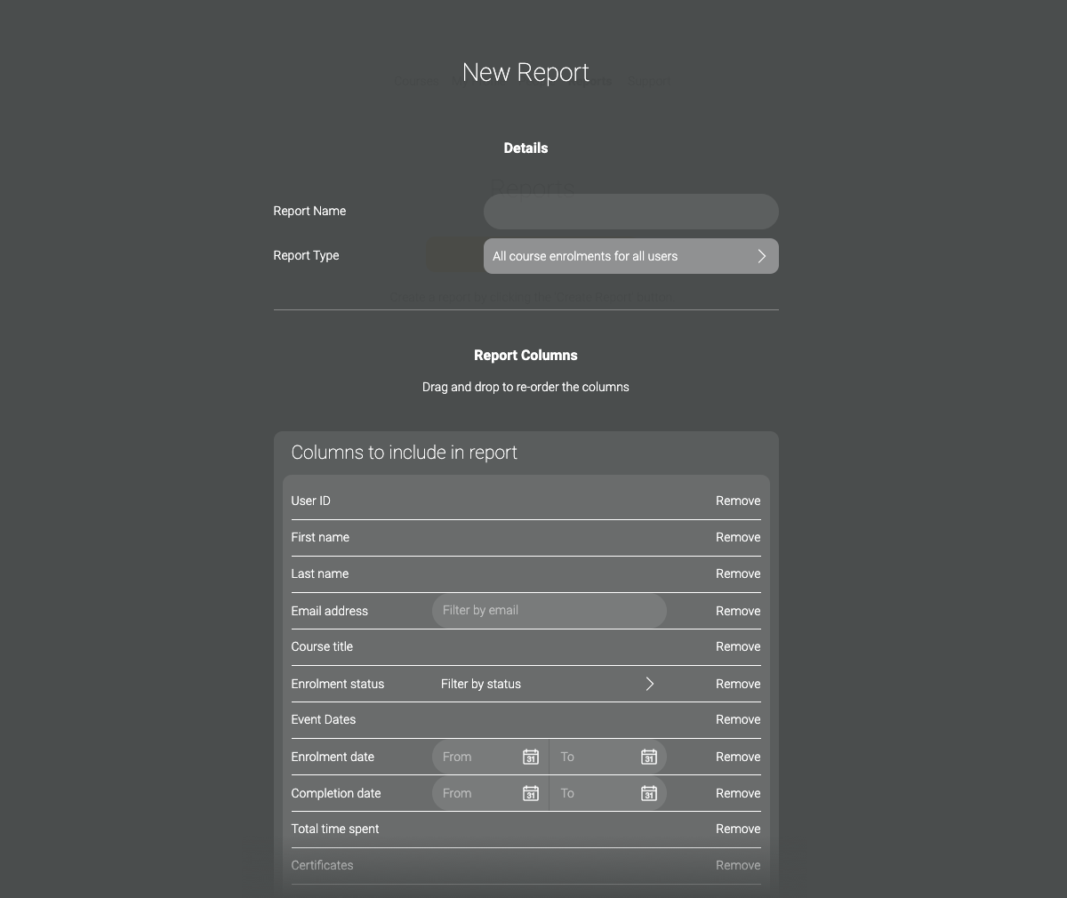
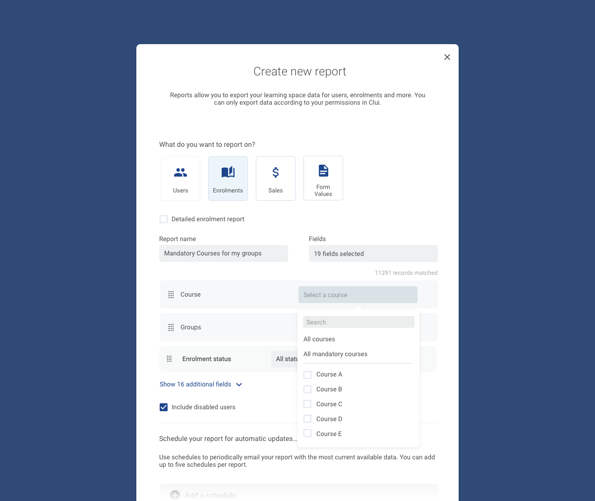
Basic reporting capabilities
Reporting in Clui was very basic, and clients often found it difficult to obtain the information they needed on their learners and course enrolments, and get an overview of training progress – this is particularly important for compliance, for an organisation to know how many of their employees have completed a certain course, or when they’re due to complete it again.
By working with some of Clui’s main clients and finding out the key metrics they were interested in seeing at a glance, I designed a dashboard with customisable widgets, which were the basis of the new home page in Clui. Now, as soon as a training manager logs in, they can see where all of their learners’ training is at, view completion on a course by course basis, and see all of their outstanding approvals and assessments.
As clients found the page more and more powerful, we received a lot of feedback and even custom development requests to tailor the page to their specific needs.
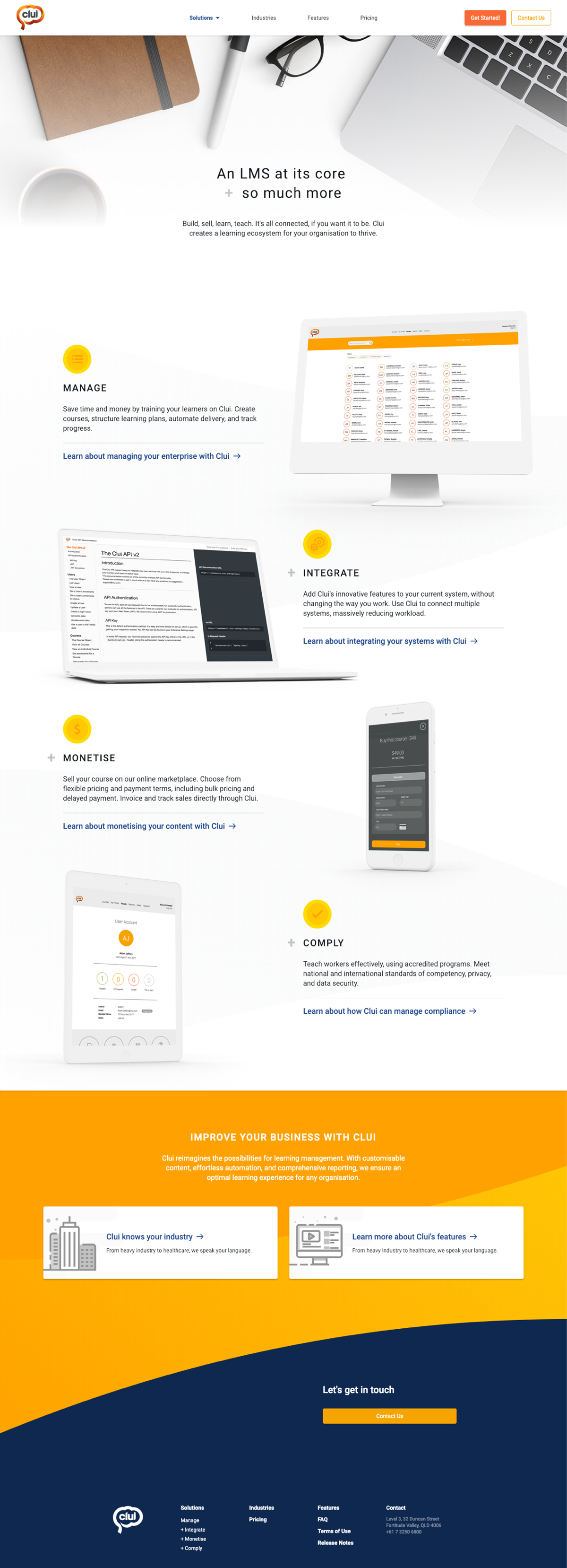

Outdated marketing site without clear messaging
The LMS space is very crowded, so a clear and concise marketing website is important. The Clui website was too complex, without a proper message, or visuals to accompany the copy on each of the features. The brand and tone of the company had also evolved, and the website needed updating to become aligned with these.
As the problems in Clui were ironed out, and new features were implemented, I was able to leverage my experience in marketing and web design to create a new website for the product, tailored to the three main user personas.
Much like the work on the product, the idea was to consolidate and remove as much as possible from the site, to make it easier for the audience to absorb the information and understand what makes Clui a great product.