
Clui Website Redesign
Clui is an online Learning Management System (LMS) used to create, distribute and manage learning content. The Clui website needed a redesign with a better user experience in mind, and more consideration for the use cases of the product. With the extensive improvements and new features in Clui, it was also a great opportunity to refresh the site’s content.
Instead of investing a lot of time into the website redesign, the idea was to get something new and improved up (ie. shipping beats perfection), and show users the new additions to the product, with precise user journeys through the website, but also to give them just enough information so that they were enticed into trialling Clui for themselves.
Understanding user personas
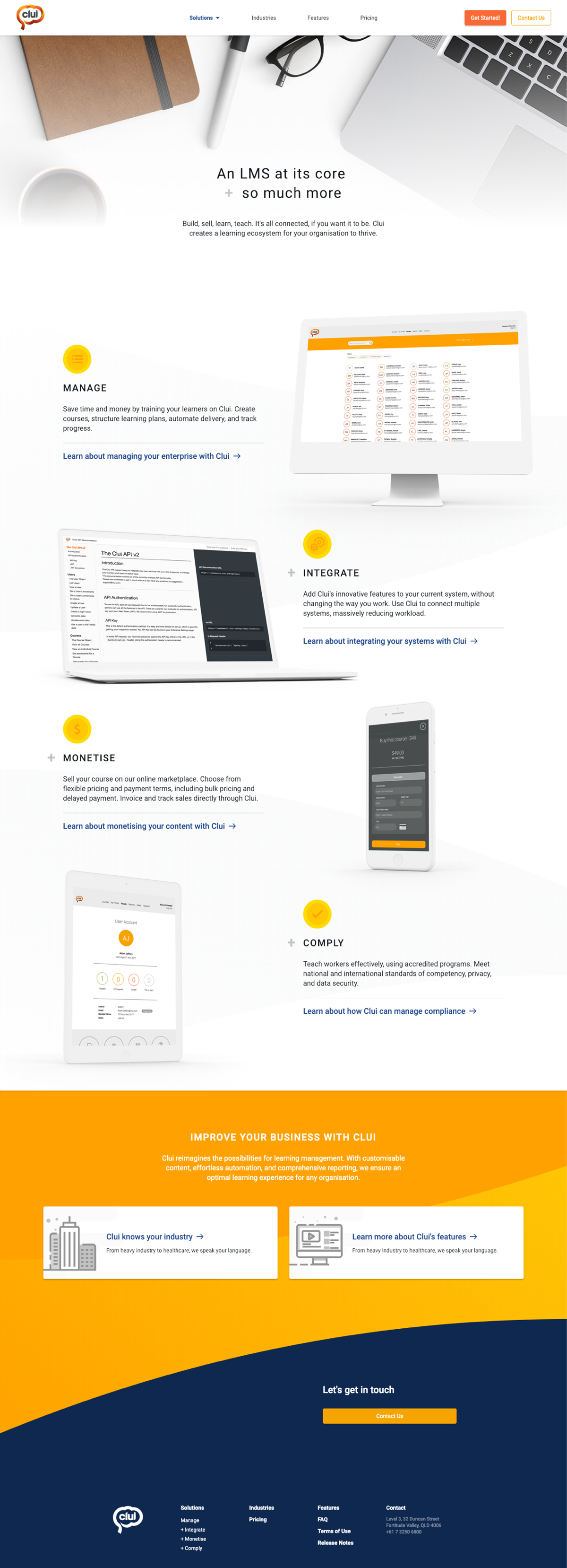
One of the issues with the previous website is that it didn’t really talk to the user personas of Clui – the new website talks to each type of user, with specific information for each of the personas – whether looking to sell training material, simplify compliance in the workforce, or integrate with other products.
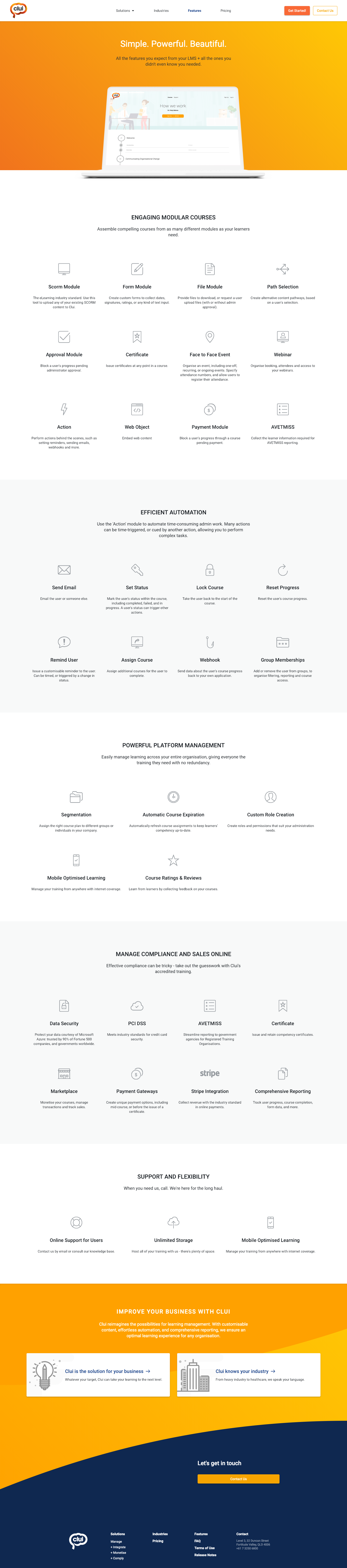
The home page features each of these solutions, which leads the user to more information about features they’ll specifically use in order to get the job done. The previous website did not have a very good flow of information, and bombarded the user with details about all of the features, some of which they probably wouldn’t have even used.
Less is more
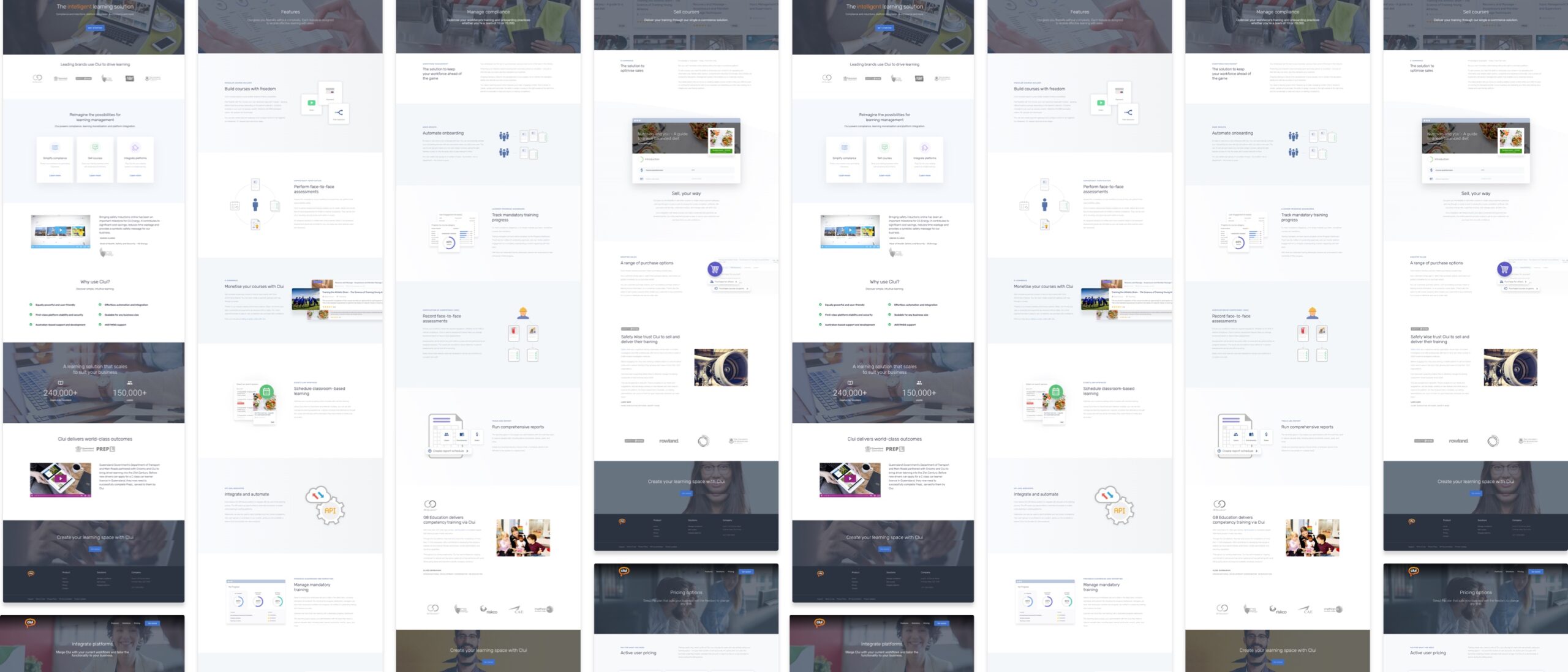
Rather than complicating the website, and having to produce more content than necessary, the aim behind the redesign was to provide the user with a teaser about the product, in order for them to decide if they wanted to start a trial of the product, or contact Sales for a demo. The previous website had an excess of information, which not only confused the user, but made it hard to maintain and keep the content current.
Informed decisions
Design decisions were based around tried and tested website layouts, and some A-B testing to ensure the most conversions. Google analytics were used and the click throughs and enquiries were monitored in comparison to the previous website. The new site was also validated internally and with prospective clients, to ensure the information was clear and concise.
Once the website was published, additional landing pages were created and linked to online ads such as Adwords, tailored to each of the user personas and use cases.